Introduction
Graphs are powerful tools used to simplify complex data. However, they can also be easily manipulated. Understanding how graphs can be misleading is essential if you want to interpret data correctly.
From news reports to business presentations, misleading graphs are everywhere. These visuals often distort reality without technically lying, making them even more dangerous.
In this article, you’ll learn how graphs can be misleading, discover real examples, and understand how to spot misleading data instantly.
Research from Pew Research Center shows that visual data strongly influences how people interpret information.
Why Graphs Can Be Misleading (And How Graphs Can Be Misleading in Real Life)
Graphs influence how we perceive information. A well-designed chart can clarify trends, but a poorly constructed one can completely distort them.
Many misleading graphs are not technically incorrect. Instead, they manipulate:
- scale
- proportions
- timeframes
- visual design
This is why understanding how graphs can be misleading is critical in today’s data-driven world.
A detailed explanation of misleading data visualization techniques can be found on Data to Viz.
7 Ways Graphs Can Be Misleading
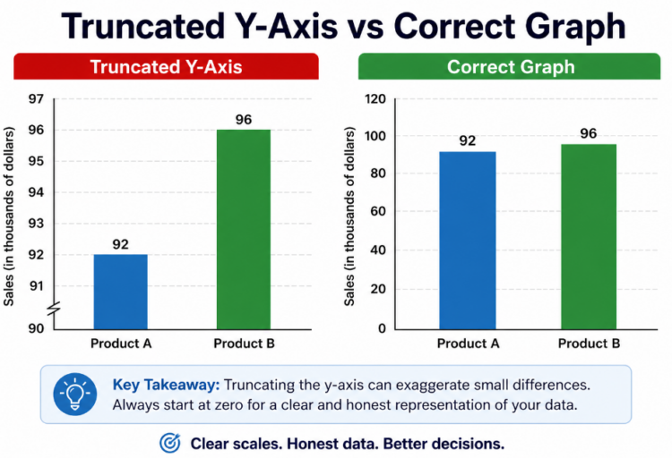
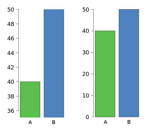
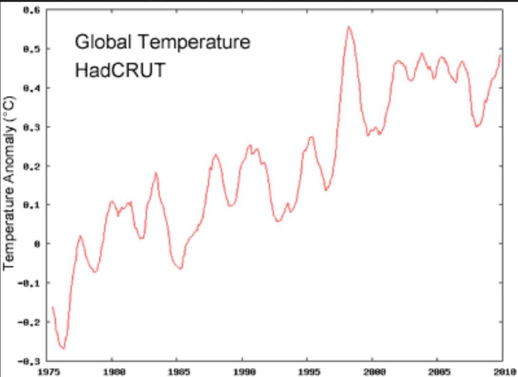
1. Truncated Y-Axis
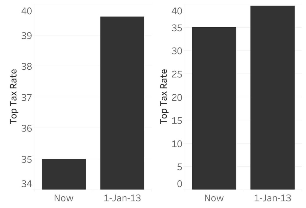
One of the most common ways graphs mislead is by truncating the y-axis.
Instead of starting at zero, the graph begins at a higher value, making small differences look dramatic.
👉 Example: A 2% increase appears as a sharp spike.
2. Cherry-Picked Data
Graphs can be misleading when only selected data points are shown.
By removing inconvenient data, a trend can be made to look stronger or weaker than it really is.
👉 This is often used in news and marketing.
3. Misleading Scales
Changing the scale of a graph can completely alter its interpretation.
For example:
- uneven intervals
- compressed ranges
👉 can exaggerate or minimize trends.
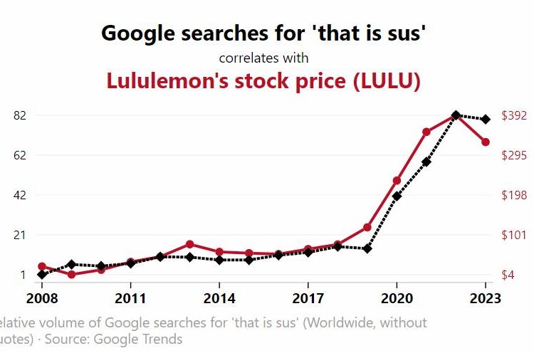
4. Dual Axis Charts
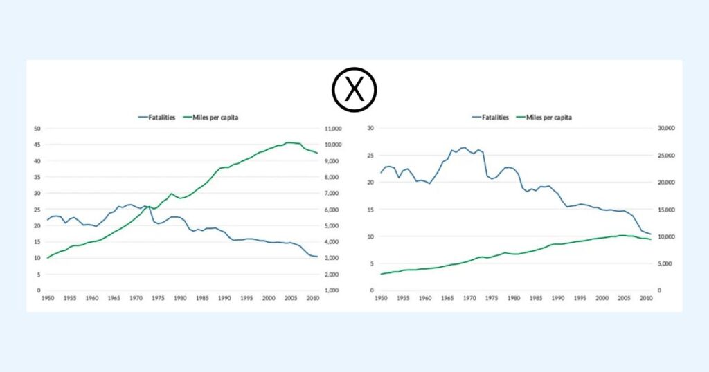
Dual-axis graphs use two different scales on the same chart.
This can falsely suggest a correlation between unrelated variables.
👉 very common in financial and media reports.
5. 3D Charts Distortion
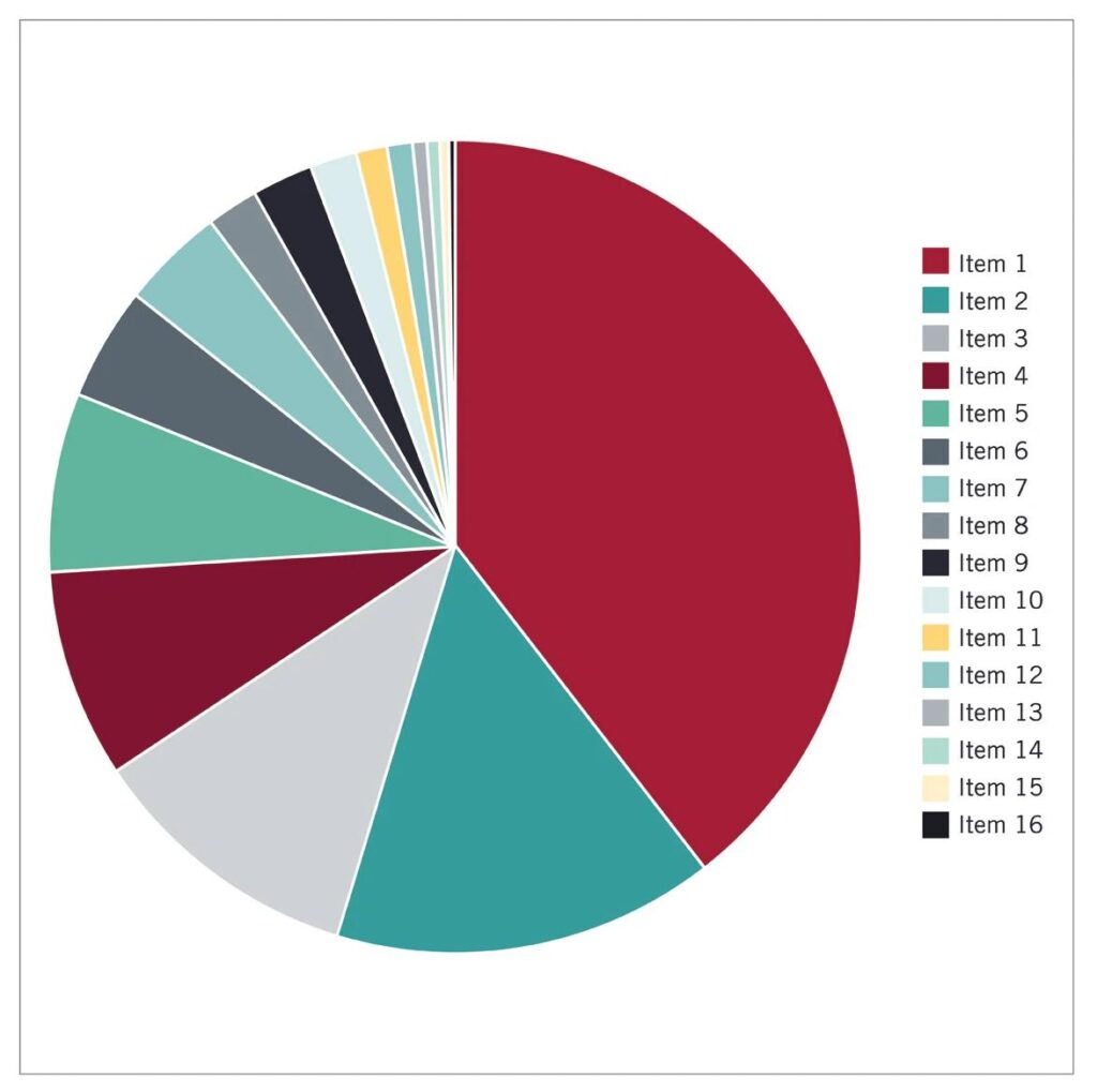
3D charts may look visually appealing, but they distort perception.
Angles and depth can make values appear larger or smaller than they actually are.
👉 pie charts are especially problematic in 3D.
6. Misleading Percentages
Graphs that use percentages instead of absolute numbers can mislead readers.
A “50% increase” may sound dramatic, but the actual change could be very small.
7. Selective Timeframes
Choosing specific time ranges can completely change a graph’s message.
Short timeframes can hide long-term trends, while long ones can smooth out important changes.
Many misleading graph examples are based on datasets available on platforms like Statista.
How to Spot Misleading Graphs
To identify misleading graphs quickly, ask yourself:
- Does the axis start at zero?
- Is the timeframe complete?
- Are all data points included?
- Is the scale consistent?
- Does the graph look exaggerated?
If something feels off, it probably is.
Educational resources such as Khan Academy explain how data can be misinterpreted.
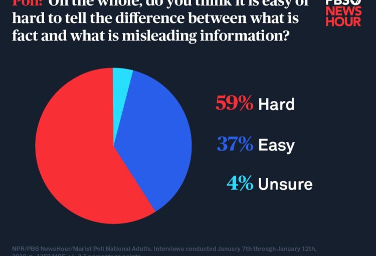
Misleading Graphs in News and Media
Many examples of misleading graphs appear in news articles and media reports.
If you want to explore real-world cases, check this detailed analysis:
👉 https://empirestats.net/2026/03/26/misleading-graphs-examples/
You can also explore how media uses data in this article:
👉 https://empirestats.net/examples-of-misleading-news/
Recommended Resources
To better understand how graphs can be misleading and improve your data literacy, you can explore:
- data visualization guides
- statistics courses
- real-world datasets
Platforms like Amazon and Udemy offer useful beginner-friendly resources.
FAQ
How can graphs be misleading?
Graphs can be misleading by manipulating axes, scales, data selection, or visual design to exaggerate or hide trends.
Why are graphs misleading?
Graphs are misleading because they simplify complex data and can be easily manipulated without being technically false.
What is a misleading graph?
A misleading graph is a visual representation of data that distorts the true meaning or perception of the data.
Conclusion
Understanding how graphs can be misleading is essential in a world where data is everywhere.
By learning to question graphs and analyze how they are constructed, you can avoid being misled and make better decisions.
The next time you see a chart, take a closer look – it may not be telling the full story.