Introduction
Graphs are supposed to clarify information – yet in 2025, they’re still one of the most common ways data gets distorted. From social media infographics to corporate reports, visuals can easily manipulate perception by exaggerating trends, hiding context, or misusing scales.
This article explores 10 misleading graphs examples from real data and shows how to spot them.
Part 1. Why Misleading Graphs Work
Even intelligent viewers can be deceived by a visual that “looks” convincing.
Three main psychological factors make misleading graphs powerful:
- Visual bias – Our brains process shapes and slopes faster than text, so we trust what we see.
- Authority effect – People tend to believe charts because they look “scientific.”
- Framing – The way data is presented influences interpretation more than the data itself.
A 2024 Pew Research study showed that over 60% of adults in the U.S. have shared a misleading visual online without realizing it.
Part 2. Common Tricks Used in Misleading Graphs Examples
Some of the most frequent manipulations include:
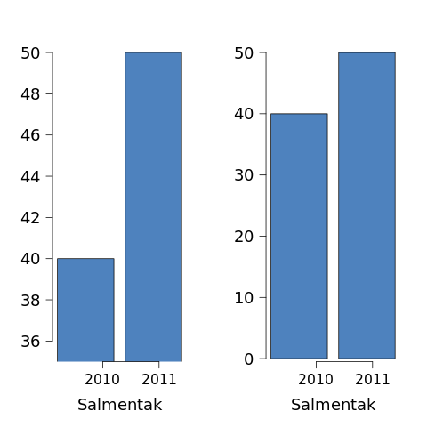
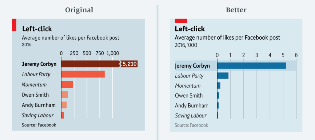
- Truncated axes (starting at a higher value to exaggerate differences)
- Improper scaling (non-linear axes or inconsistent intervals)
- Cherry-picked data (selecting only part of a dataset)
- Overlapping or 3D charts (harder to read accurately)
- Ambiguous labeling (missing context or unclear categories)
For example, a 3D pie chart might make a slice look twice as big simply due to perspective, not data difference.
These misleading graphs examples show how easily visuals can change perception even without false numbers.
Read more about data interpretation in our article:
👉 Why People Fall for Misleading Statistics (Coming Soon)
Part 3. 10 Real-Life Misleading Graphs Examples in 2025
Below are real or realistic examples illustrating how graphs can twist the truth.
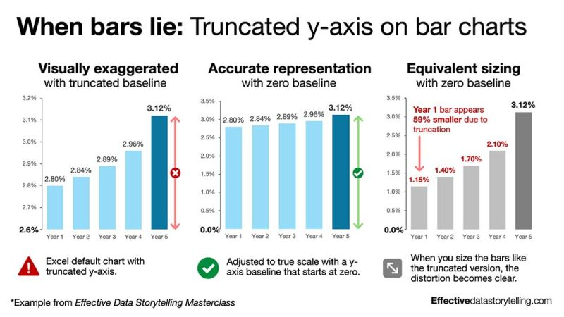
1. Truncated Y-axis in Political Polls
A news outlet displayed candidate approval ratings starting the Y-axis at 40%, making minor shifts appear dramatic.
→ Trick: Visual exaggeration of small differences.
2. Cherry-Picked Timeframes in Stock Charts
A tech company showed stock growth “since 2023,” omitting a huge drop in 2022.
→ Trick: Selective data framing.
3. 3D Pie Charts in Marketing Reports
A “market share” infographic made one brand seem dominant through 3D distortion.
→ Trick: Visual illusion via perspective.
4. Inconsistent Intervals on the X-axis
A government dashboard spaced months unevenly, creating a fake trend.
→ Trick: Non-linear axis scaling.
5. Missing Labels in Energy Consumption Charts
A global energy report left out regional context, implying uniform usage worldwide.
→ Trick: Lack of clarity = false equivalence.
6. Unequal Bar Widths in Advertising
Bars were thicker for a “preferred” brand – not higher, just wider.
→ Trick: Visual weight influencing perception.
7. Reversed Color Scales in Health Data
A heatmap showed “red = safe, green = danger,” confusing readers.
→ Trick: Breaking color convention.
8. Double Y-Axis Inflation Graphs
An inflation chart used two Y-axes – one for CPI, one for wages – aligned to make them look correlated.
→ Trick: False correlation visualized.
9. Partial Pie Charts on Social Media
An influencer posted half a pie chart showing only “positive responses,” leaving out the rest.
→ Trick: Cropped data to mislead viewers.
10. Missing Baseline in Climate Graphs
A temperature anomaly chart omitted the baseline average, exaggerating warming visually.
→ Trick: Context removal = amplified emotion.
Part 4. How to Identify Misleading Graphs
To protect yourself from visual manipulation:
- Check the axes: Does it start at zero?
- Compare scales: Are intervals consistent?
- Look for missing data: Any years or categories skipped?
- Question the source: Is there bias or marketing intent?
- Reverse-search the graph: Sometimes the original dataset tells another story.
For deeper insight, see:
Conclusion
By studying these misleading graphs examples, you’ll be able to recognize visual manipulation anywhere you see data.
Misleading graphs will never disappear – but awareness is your best defense.
By learning to question visual information, you become part of a more data-literate public.
Next time you scroll past a chart on social media or see one in the news, pause and ask:
“Is this visualization informing me – or persuading me?”
FAQ
Q1. Are misleading graphs always intentional?
Not always. Some are caused by poor design or lack of data literacy, but others are deliberate manipulations.
Q2. What’s the difference between misleading and inaccurate graphs?
Misleading graphs distort perception without necessarily lying about numbers; inaccurate ones use wrong data.
Q3. How can I check if a graph is real?
Reverse-search the image or verify the dataset from the original source.
Q4. Why are 3D charts often discouraged?
They distort angles and depth, making accurate comparison harder.
If you enjoyed this article, you might also like:
- Why People Fall for Misleading Statistics (coming soon)
- Shrinkflation: The Invisible Price Hike Explained
- Blue vs. White Collar Crime: The Hidden Economic Divide
These articles expand on how data and perception influence our everyday understanding of economics and society.