Introduction
How graphs lie is something most people don’t think about. Charts are often seen as objective and trustworthy, but they can easily distort reality.
In fact, graphs lie not because the data is false, but because the way it is presented changes how we interpret it.
Understanding how graphs lie will help you recognize misleading visuals, avoid common traps, and think more critically when reading data.
Studies from MIT Sloan School of Management show that visual data strongly influences how people interpret information and make decisions.
Why Graphs Lie So Easily (And How Graphs Lie in Practice)
Graphs simplify complex information. But that simplicity can also be used to manipulate perception.
Small changes in design can:
- exaggerate trends
- hide important context
- create false impressions
That’s why understanding how graphs lie is essential in today’s data-driven world.
The American Statistical Association highlights how data presentation can lead to misinterpretation when context is missing.
10 Common Tricks Used to Mislead People
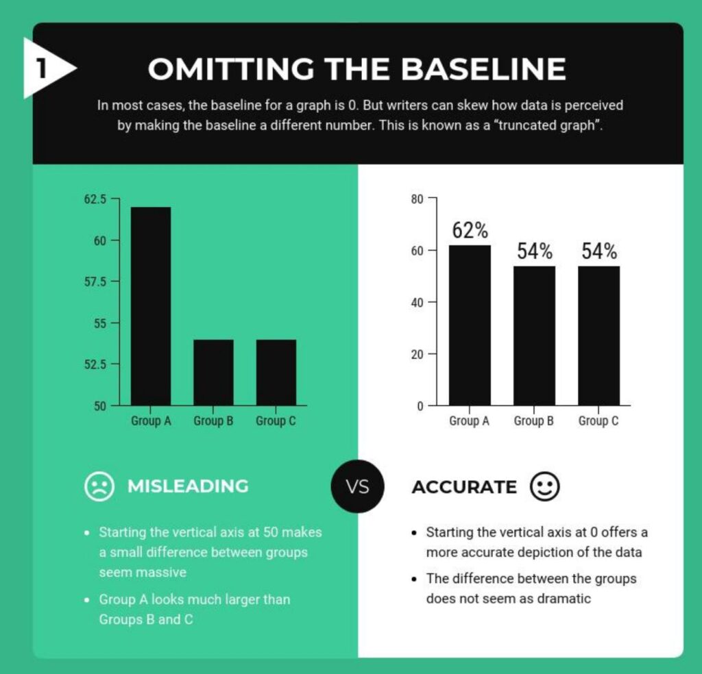
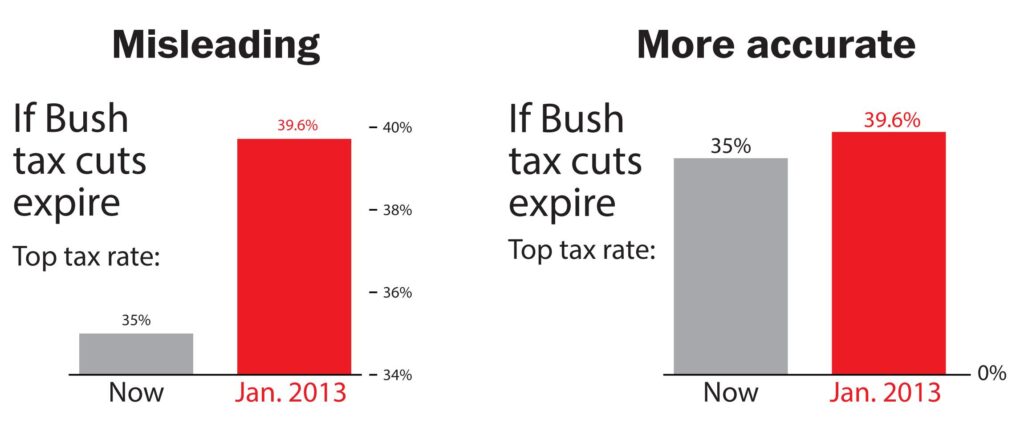
1. Truncated Y-Axis
Graphs often lie by cutting off the y-axis.
👉 This makes small differences look dramatic.
2. Manipulated Scales
Changing the scale of a chart can completely alter perception.
👉 A small variation can look huge.
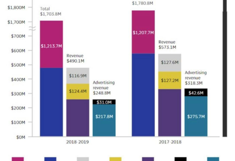
3. Cherry-Picked Data
Graphs lie when only selected data points are shown.
👉 This creates a biased story.
4. Misleading Timeframes
Short time ranges can hide long-term trends.
👉 Long ranges can hide sudden changes.
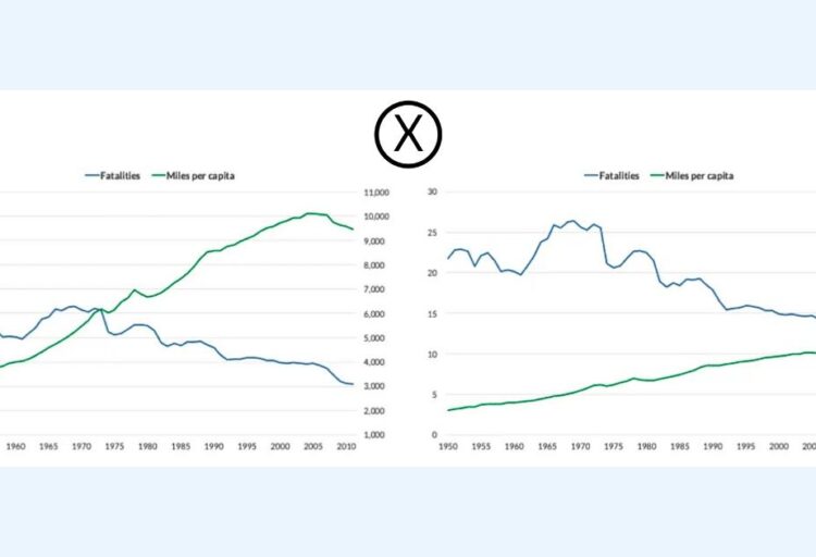
5. Dual Axis Manipulation
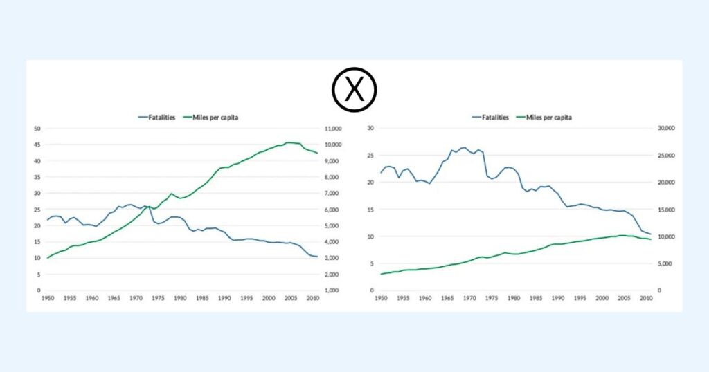
Using two different scales can create fake correlations.
👉 Very common in media charts.
6. 3D Chart Distortion
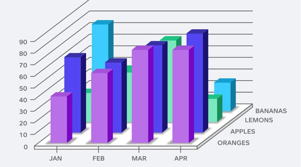
3D charts distort proportions and perspective.
👉 They look good but mislead easily.
7. Misleading Percentages
Percentages without context can exaggerate results.
8. Visual Emphasis Tricks
Colors, highlights, and shapes can influence perception.
👉 Some data appears more important than it is.
9. Missing Context
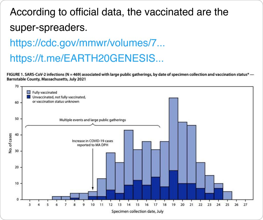
Graphs lie when key information is missing.
👉 Without context, data is misleading.
10. Overloaded Charts
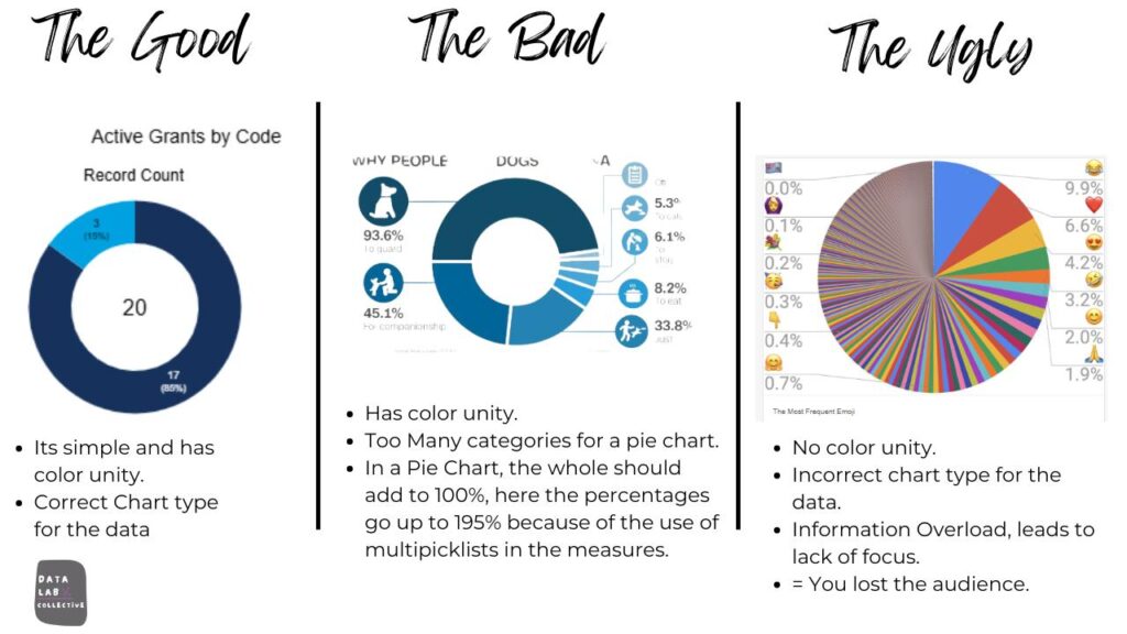
Too much data makes interpretation difficult.
👉 Confusion = misinterpretation.
How to Spot When Graphs Lie (Real Signs of How Graphs Lie)
To identify misleading charts:
- check the axes
- analyze the scale
- look for missing context
- question the design
If something looks exaggerated, it probably is.
Practical guidelines from International Institute for Analytics emphasize the importance of questioning visual data and checking sources.
Real Examples of Misleading Graphs
If you want to see real-world cases of how graphs lie:
👉 https://empirestats.net/2026/03/26/misleading-graphs-examples
👉 https://empirestats.net/misleading-data-examples
These examples show how visual data can distort reality.
Realizing how graphs lie is a critical skill in a world where data is everywhere. Whether in news, business reports, or social media, visual data can shape opinions quickly.
The more you understand how graphs lie, the easier it becomes to question what you see and avoid being influenced by misleading visuals.
FAQ
How do graphs lie?
Graphs lie by manipulating scale, axes, or data selection to distort perception.
Why are graphs misleading?
Graphs are misleading because they simplify data and can be easily manipulated.
Can graphs lie without false data?
Yes. Even accurate data can be presented in a misleading way.
How can you avoid being misled by graphs?
Always check context, scale, and data sources before trusting a chart.
🔗 Explore more misleading data
👉 https://empirestats.net/2026/03/26/misleading-graphs-examples
👉 https://empirestats.net/2026/03/16/misleading-statistics-examples