Introduction
Pie charts are one of the most popular ways to visualize data, but they are also one of the easiest charts to manipulate. Small design choices can completely distort how people interpret proportions, percentages, and comparisons.
From exaggerated 3D effects to misleading slice sizes, deceptive pie charts are commonly used in marketing, news media, politics, and business presentations to influence perception.
A pie chart is designed to represent proportions visually, but small design changes can easily distort perception.
In this article, we’ll look at 12 misleading pie charts that distort data, explain why they are deceptive, and show how to spot manipulation techniques before they fool you.
This is one reason why misleading graphs examples are so common in news, marketing, and social media.
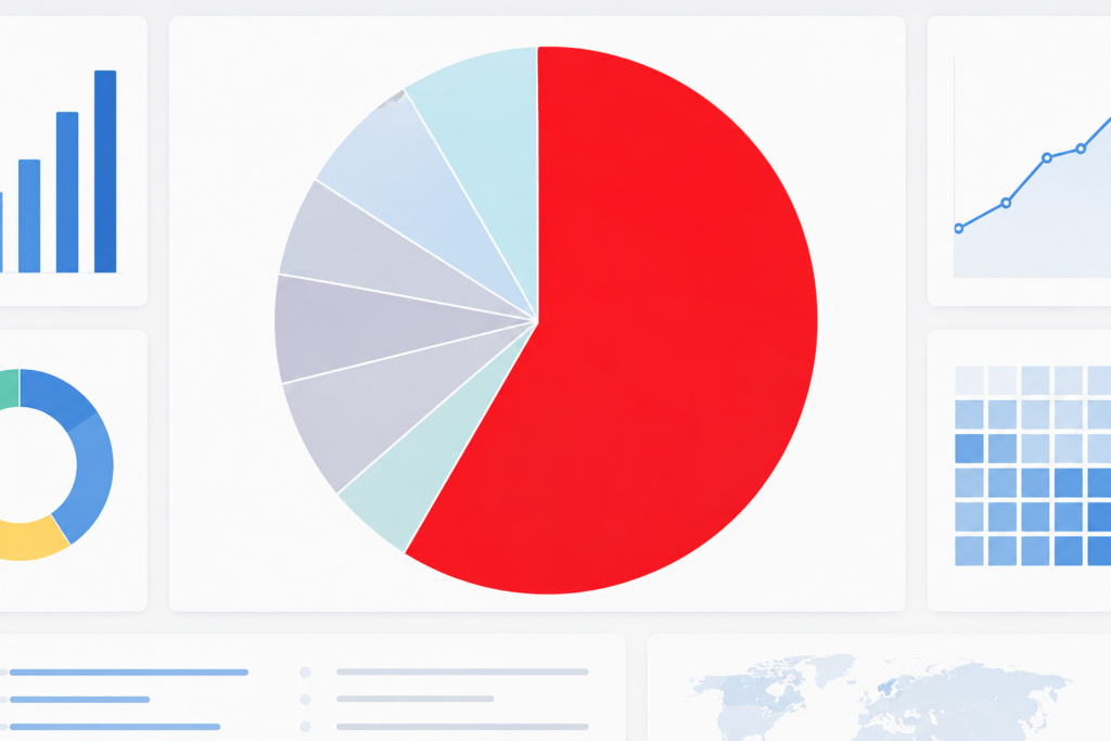
What Is a Misleading Pie Chart?
A misleading pie chart is a chart that visually distorts data proportions in a way that creates a false impression.
Pie charts are only one type of misleading data example, but they are especially dangerous because they look simple and trustworthy.
Unlike properly designed charts, deceptive pie charts manipulate:
- slice sizes
- angles
- colors
- labels
- perspective
- percentages
These tricks can make small differences appear huge or hide important information completely.
If you want to see other examples of deceptive charts, check out our guide on misleading graph examples and how graphs lie.
Why Misleading Pie Charts Are So Effective
Humans Compare Angles Poorly
People are naturally bad at comparing angles and curved areas accurately. This makes pie charts much easier to manipulate than bar charts.
Data visualization expert Edward Tufte has long criticized chart designs that distort how readers interpret quantitative information.
Many of these tricks are similar to the techniques explained in our guide on how graphs lie.
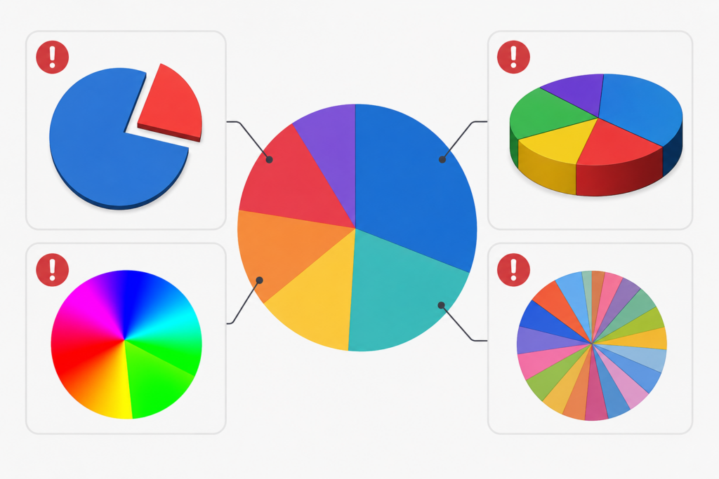
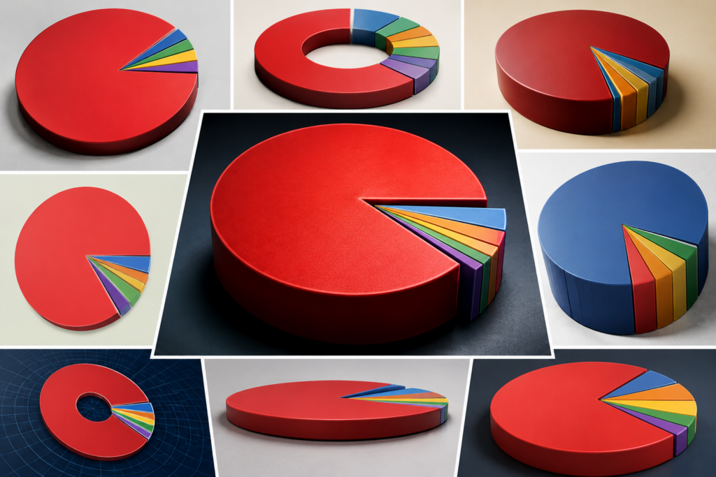
3D Effects Distort Perspective
3D pie charts often enlarge slices positioned closer to the viewer, making categories appear larger than they actually are.
Too Many Categories Create Confusion
When pie charts contain too many slices, readers struggle to compare proportions accurately.
12 Misleading Pie Chart Examples
1. The Exaggerated 3D Pie Chart
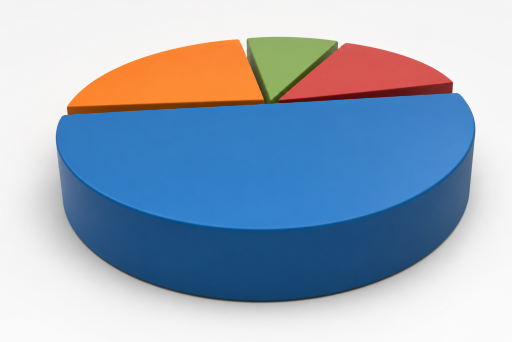
A company uses a 3D pie chart to show market share. The leading brand appears enormous because its slice is placed in the foreground.
In reality, the difference between competitors is only 5%.
This is similar to other ways graphs can be misleading, where the design changes perception more than the actual numbers.
Why It’s Misleading
The perspective exaggerates the front slice visually.
Better Alternative
Use a flat 2D pie chart or a bar chart.
2. Tiny Differences Made to Look Huge
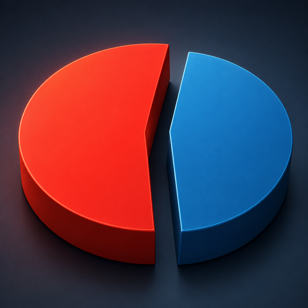
A chart compares:
- Product A: 51%
- Product B: 49%
But the slices use contrasting colors and spacing to exaggerate the gap.
Why It’s Misleading
The visual separation creates the illusion of a major difference.
3. Too Many Slices
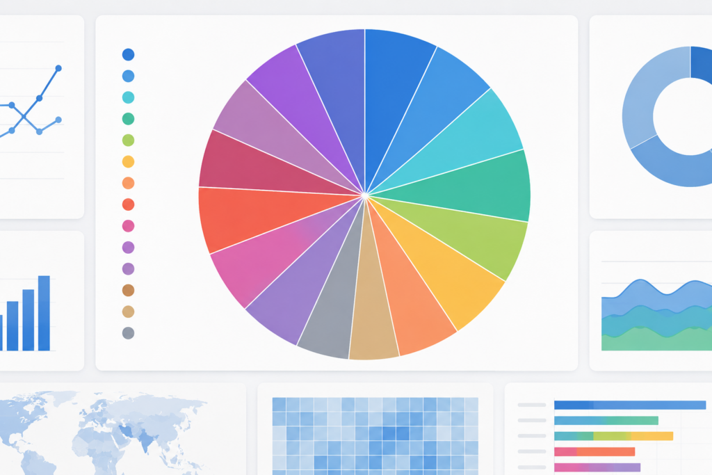
A pie chart contains 15 categories with nearly identical proportions.
Why It’s Misleading
Readers cannot accurately compare tiny slices.
Better Alternative
Use a ranked bar chart.
4. Missing Percentages
The chart includes labels but no percentages.
Missing context is also one of the most common causes of misleading statistics.
Why It’s Misleading
Without exact values, readers rely only on visual estimation.
5. Distorted Slice Angles
Some slices are manually resized for emphasis.
Why It’s Misleading
The chart no longer reflects the underlying data accurately.
6. Misleading Color Choices
Bright colors highlight certain categories while dull colors hide others.
Why It’s Misleading
Color emphasis manipulates attention.
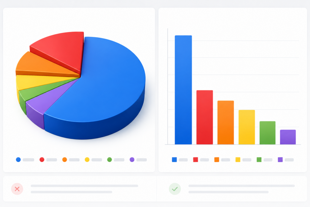
7. Exploded Pie Slices
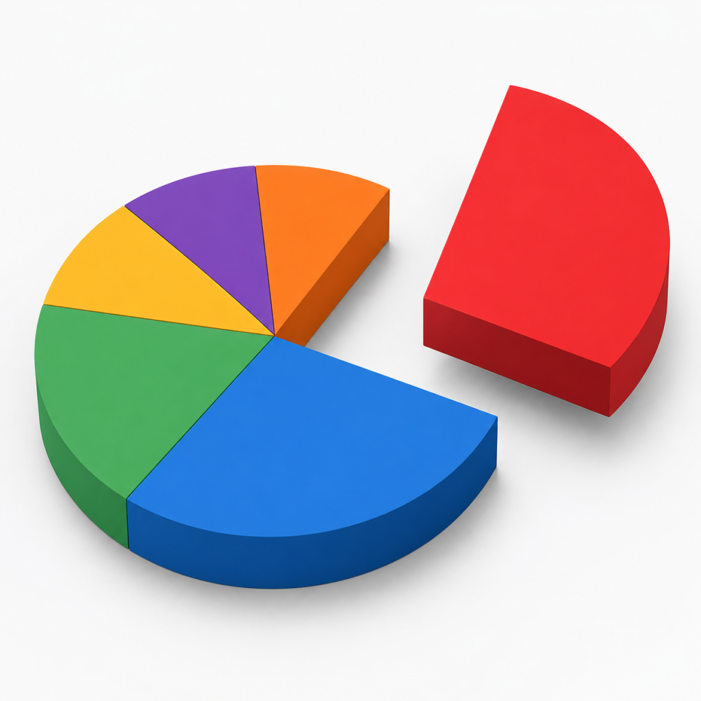
One slice is separated dramatically from the chart.
Why It’s Misleading
The isolated slice appears more important than it really is.
8. Fake “Other” Categories
Several categories are grouped into a vague “Other” section.
Why It’s Misleading
Important details are hidden.
9. Pie Charts Comparing Multiple Years
Several pie charts are shown side-by-side with inconsistent sizes.
Why It’s Misleading
Readers compare chart size instead of percentages.
10. Unequal Label Placement
Large labels are used for selected categories only.
Why It’s Misleading
Typography influences perception.
11. Partial Pie Charts
A chart displays only part of a full circle.
Why It’s Misleading
The missing context distorts proportions.
12. Decorative Pie Charts
Icons and graphics are layered on top of slices.
Why It’s Misleading
Decorative elements distort area perception.
How to Spot Misleading Pie Charts
Here are common warning signs:
- exaggerated 3D effects
- missing percentages
- too many categories
- inconsistent colors
- exploded slices
- distorted perspectives
- oversized labels
- hidden scales
If you want to compare this with another classic chart manipulation technique, read our guide to truncated y-axis graph examples.
Many of these tricks also appear in misleading bar graphs and truncated axis charts.
Better Alternatives to Misleading Pie Charts
In many cases, pie charts are not the best option.
Better alternatives include:
- bar charts
- stacked bar charts
- treemaps
- dot plots
- tables with percentages
Bar charts are usually easier for humans to compare accurately.
For more design mistakes to avoid, see our guide on data visualization mistakes.
According to the Datawrapper guide on pie charts, bar charts are often easier for readers to compare accurately.
Recommended Books on Data Visualization
If you want to learn how to create clearer, more honest charts, these two books are excellent starting points:
As an Amazon Associate, I earn from qualifying purchases.
How to Avoid Creating Misleading Pie Charts
To create honest charts:
- avoid 3D effects
- limit categories
- include exact percentages
- use consistent colors
- avoid decorative distortions
- choose simpler chart types when possible
Transparency improves trust and readability.
Resources like Storytelling With Data provide excellent guidance for creating clear and honest visualizations.
FAQ
Why are pie charts misleading?
Pie charts can mislead because humans struggle to compare angles and curved areas accurately. Design tricks like 3D effects and distorted slices make this even worse.
Are pie charts bad for data visualization?
Not always. Pie charts work best when showing a few simple categories with clear differences.
What is the biggest problem with pie charts?
The biggest issue is that small visual distortions can dramatically change perception.
What chart is better than a pie chart?
Bar charts are usually more accurate and easier to compare.
Why do people still use pie charts?
They are familiar, visually appealing, and easy to understand at a glance.
Conclusion
Misleading pie charts are everywhere, from news articles to business reports and social media graphics. Small visual manipulations can completely change how people interpret data.
By learning how deceptive pie charts work, you can avoid being misled and create more accurate visualizations yourself.
If you want more examples of manipulated data visualization, explore our guides on misleading statistics examples, misleading graphs examples, and common ways graphs lie.