Introduction – Why Data Can Mislead
Numbers don’t lie… or do they?
Every day, we’re bombarded with statistics: in the news, on social media, and in political debates. While numbers might seem like the ultimate truth, they can be presented in ways that are highly misleading.

In this guide, we’ll look at misleading data real life examples, the tricks behind them, and how you can spot when a statistic is telling a distorted story. Whether it’s economic figures, health studies, or political polling, the misuse of data is everywhere – and being able to recognize it is one of the most valuable skills in the modern world.
The Common Ways Statistics Are Misused
Before diving into specific misleading statistical data examples, it’s important to understand how numbers get twisted in the first place.
Cherry-Picking Data
One of the most common misuse of statistics fallacy techniques is cherry-picking – selecting only the data points that support your argument while ignoring the rest.
Example: A politician might show only the months where unemployment fell, ignoring the months where it rose again.
Source: Harvard Business Review – “Cherry-Picking Data: Why It Happens and How to Avoid It”
📚 Best Books to Understand Misleading Data
If you want to understand how data can be manipulated and learn to think critically about numbers, these books are highly recommended:
- How to Lie with Statistics (Best Seller) – the classic introduction to misleading data
- Naked Statistics – understand the real meaning behind numbers and probabilities
- Thinking, Fast and Slow – learn how cognitive biases affect how we interpret data
Confusing Correlation with Causation
Just because two numbers move together doesn’t mean one caused the other.
Example: Ice cream sales and drowning rates rise in summer, but ice cream doesn’t cause drowning – both are linked to hot weather.
Source: Tyler Vigen’s Spurious Correlations
Small Sample Sizes
A study with 20 people can’t be applied to an entire population, but you’ll still see such research reported in headlines as if it were universally true.
Source: American Statistical Association – “Why Sample Size Matters“
Misleading Data Real Life Examples in Crime, Economics, and Health
Let’s explore concrete cases where numbers, graphs, and reports have been used in ways that distort reality.
Crime Rate Reporting
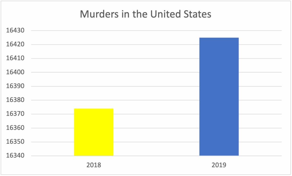
A city might claim crime has “dropped by 50%” in a year – but if the number of crimes went from 4 to 2, the percentage sounds dramatic while the actual change is tiny. This is one of the most common misleading statistical data examples in local politics.
Economic Growth Figures
Governments often cite GDP growth as proof of a thriving economy. But GDP per capita might be stagnant or falling, meaning the average citizen isn’t actually better off. Here’s a misleading data real life example: Country X’s GDP rose 3% last year, but due to rapid population growth, GDP per capita actually decreased.
Health Study Results
A headline might scream “New drug reduces cancer risk by 50%!” but the real story could be that the risk went from 2 in 1,000 to 1 in 1,000. The relative change sounds huge, but the absolute change is minimal.
📖 Want to Get Better at Reading Data?
Many misleading data examples look convincing at first. Learning how to question numbers and understand context is key.
- How to Lie with Statistics – learn the most common statistical tricks
- Naked Statistics – build intuition about numbers and data
Misleading Data Real Life Examples in Visualizations
Even accurate numbers can be made misleading through clever graphs.
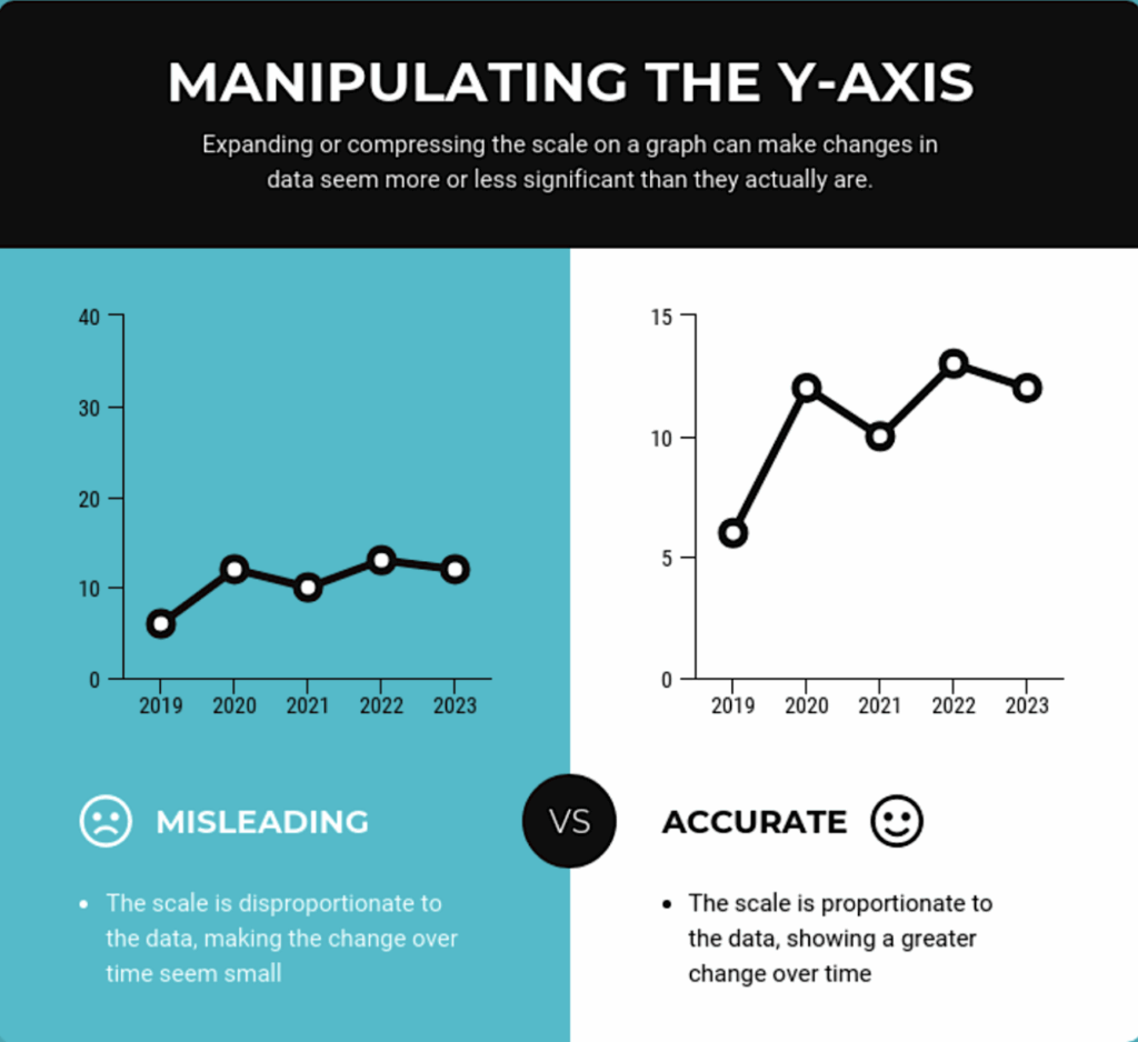
Truncated Axes
By starting the Y-axis at 90 instead of 0, small differences appear massive. This is a classic misleading data visualization example used in marketing and politics.
Manipulating Time Frames
Zooming in on a short period where numbers rise (and ignoring the longer trend of decline) can make a failing business look successful.
Selective Color Use
Choosing bright red for one bar and pale gray for the rest can make a category stand out even when it’s not statistically significant.
Misleading Statistics in the News
News outlets often simplify or exaggerate data to make it more engaging.
- Political Polls: Headlines focus on a single poll without noting the margin of error or differences between pollsters.
- Economic Reports: “Unemployment falls to record low” – but not mentioning underemployment or part-time work trends.
- Health Risks: “Coffee doubles your risk of heart disease” – without clarifying the baseline risk or context.
A recent example of misleading statistics in the news involved global inflation data. Some outlets highlighted month-to-month declines, suggesting inflation was “over,” while ignoring the fact that annual inflation rates remained high.
How to Read Data Like a Pro
Spotting misleading data real life examples requires a skeptical mindset and a few key habits:
- Check the Source – Is it reputable and transparent about methods?
- Look for Sample Size – The bigger the sample, the more reliable the data.
- Understand the Metric – Percentages, averages, and medians can tell very different stories.
- Compare Multiple Data Sets – Don’t rely on one report; see what other sources say.
- Watch for Visual Tricks – Axes manipulation, selective coloring, and zoomed-in graphs.
📘 Improve Your Data Literacy
Understanding misleading data is one of the most valuable skills today. These books will help you go beyond examples and build real critical thinking skills:
Conclusion – Why Data Literacy Matters
In an era of information overload, numbers are powerful tools – but also dangerous weapons when misused. By recognizing misleading data real life examples, you’ll be able to cut through the noise and make better decisions.
Remember: every statistic has a story, but not every story is the whole truth. Stay curious, question the numbers, and you’ll avoid becoming the victim of the next headline-worthy misuse of statistics fallacy.
Interested in exploring more global trends and surprising shifts?
See how international trade battles are shaping economic power:
👉 China Trade Deal with the US – What It Really Means
https://empirestats.net/2025/07/01/china-trade-deal-us/
Discover how changing birth rates could transform the future:
👉 Chaotic Population Growth – Visualized on a Graph
https://empirestats.net/2024/12/27/chaotic-population-growth-on-a-graph/
Or dive into a bold experiment redefining the workplace:
👉 New Tesla Babies Program – The 1st Revolutionary Workforce Initiative
https://empirestats.net/2024/12/20/new-tesla-babies-program-the-1st-revolutionary-workforce-initiative/