Introduction
Misleading statistics examples are everywhere. From media headlines to marketing campaigns and political speeches, numbers are often presented in ways that create a misleading impression.
Statistics are powerful tools for explaining complex information. But when data is taken out of context, selectively chosen, or presented without proper explanation, it can distort reality.
In this article, we’ll examine 50 misleading statistics examples used in media, advertising, politics, and everyday discussions – and explain why these numbers can easily fool millions of people.
Why Misleading Statistics Are So Common
Statistics are powerful persuasive tools. A single number can shape opinions much faster than a long explanation.
Unfortunately, this also makes statistics easy to misuse.
Some of the most common techniques include:
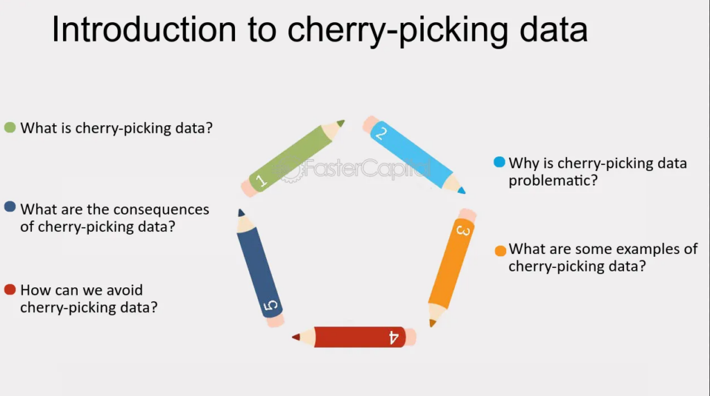
- Cherry-picking data
- Using percentages without context
- Misleading averages
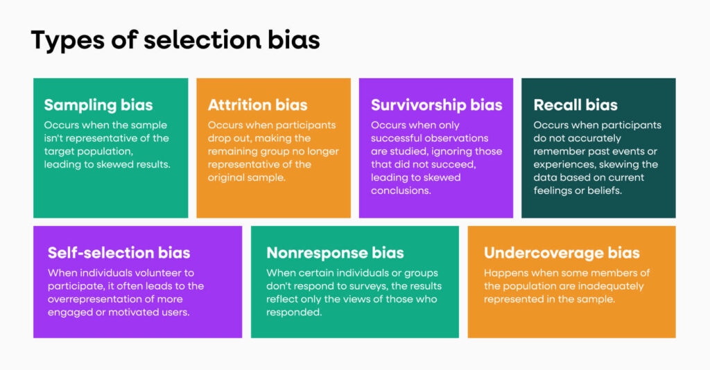
- Small or biased samples
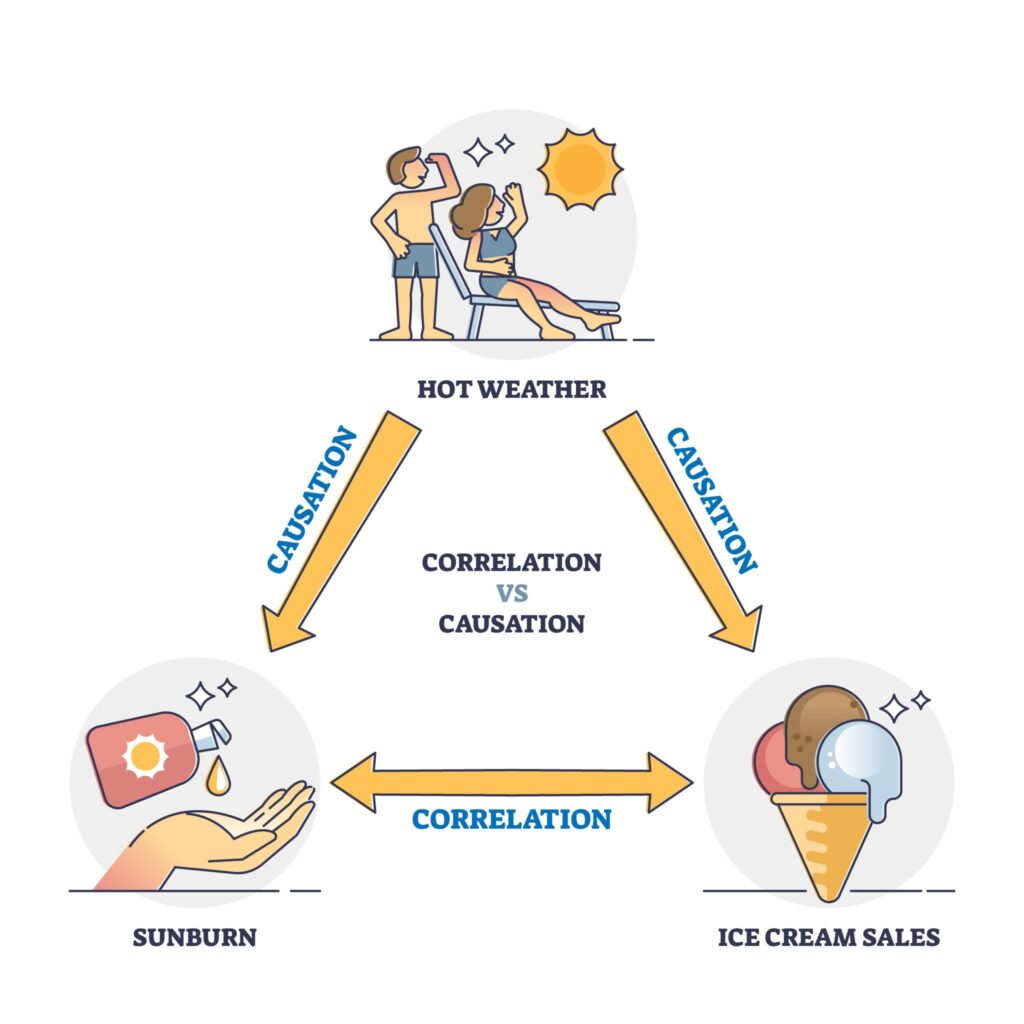
- Confusing correlation with causation
These techniques appear frequently in media headlines, political speeches, and marketing campaigns.
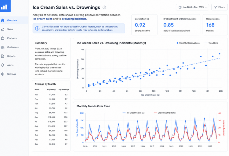
If you’re interested in visual data manipulation, you may also want to read our article on misleading graphs examples which shows how charts can distort statistics visually.
📚 Best Books to Understand Misleading Statistics
If you want to understand how statistics can be misleading and learn how to think critically about numbers, these books are highly recommended:
- How to Lie with Statistics (Best Seller) – the classic introduction to misleading data
- Naked Statistics – understand the real meaning behind numbers and probabilities
- Thinking, Fast and Slow – learn how cognitive biases affect how we interpret statistics
50 Misleading Statistics Examples
Below are 50 examples showing how statistics can mislead readers even when the numbers themselves are technically accurate.
Example #1 – “90% of Diets Fail”
This statistic appears frequently in articles and diet advertisements.
However, the number often comes from outdated research from the 1950s and 1960s that followed a small group of participants.
Why it’s misleading:
- Many participants dropped out of the study.
- The results may not represent modern dieting methods.
Example #2 – “People Only Use 10% of Their Brain”
This statistic is widely repeated in movies, books, and motivational speeches.
Modern brain imaging clearly shows that most areas of the brain are active throughout the day.
Why it’s misleading:
- The number is a myth with no scientific basis.
Example #3 – “Crime Increased by 200%”
A headline might claim that crime increased by 200%.
But if incidents increased from 1 case to 3 cases, that is technically a 200% increase.
Why it’s misleading:
- The percentage sounds dramatic even though the total numbers are small.
Example #4 – “Average Salaries Increased by 10%”
An economy may report that average wages increased significantly.
But averages can be skewed by very high earners.
Why it’s misleading:
- Median income may stay the same even if the average increases.
Example #5 – “80% of Customers Prefer Brand X”
Many marketing surveys claim overwhelming consumer preference.
But the survey might only include existing customers of the brand.
Why it’s misleading:
- The sample is biased.
Example #6 – “50% of Marriages End in Divorce”
This number has been repeated for decades.
However, divorce rates vary significantly by age, education, and income.
Why it’s misleading:
- It ignores demographic differences.
Example #7 – “Drinking Coffee Reduces Heart Disease by 40%”
Health studies often report dramatic percentage changes.
But the baseline risk may be extremely small.
Why it’s misleading:
- A 40% reduction may represent a tiny absolute change.
Example #8 – “Our Product Is 99% Effective”
Many advertisements claim extremely high effectiveness.
But the statistic may come from small internal studies.
Why it’s misleading:
- Lack of independent verification.
Example #9 – “One in Three People Will Experience This Problem”
This type of statistic often appears in health awareness campaigns.
However, the definition of the condition may be extremely broad.
Why it’s misleading:
- The statistic inflates perceived risk.
Example #10 – “Smartphone Use Increased 300%”
Technology reports often highlight rapid growth.
But early adoption numbers may have been extremely small.
Why it’s misleading:
- Percentages exaggerate growth.
📖 Want to Get Better at Reading Statistics?
Many misleading statistics examples look convincing at first. Learning how to question data and understand context is key.
- How to Lie with Statistics – learn the most common statistical tricks
- Naked Statistics – build intuition about numbers and data
Example #11 – “The Average Student Debt Is $30,000”
Some students borrow far more than others.
Why it’s misleading:
- The average hides large variation.
Example #12 – “Online Ads Increase Sales by 400%”
Marketing reports often use selective data.
Why it’s misleading:
- Results may apply only to a specific campaign.
Example #13 – “10,000 Steps Is the Ideal Daily Goal”
This number originated from a Japanese marketing campaign for a pedometer in the 1960s.
Why it’s misleading:
- The number was never based on scientific research.
Example #14 – “Violent Crime Is Rising Everywhere”
Crime statistics can vary significantly between regions.
Why it’s misleading:
- National averages hide local trends.
Example #15 – “Vaccines Cause Side Effects in 20% of People”
This may include mild effects like fatigue or soreness.
Why it’s misleading:
- The statistic exaggerates perceived risk.
Example #16 – “Most Startups Fail”
Startup failure rates vary depending on industry and timeframe.
Why it’s misleading:
- Definitions of “failure” differ.
Example #17 – “90% of Data Was Created in the Last Two Years”
This claim often appears in technology reports.
Why it’s misleading:
- The statistic depends heavily on how “data” is defined.
Example #18 – “The Economy Grew by 3%”
GDP growth does not necessarily reflect individual living standards.
Why it’s misleading:
- Economic growth may be unevenly distributed.
Example #19 – “People Spend 4 Hours per Day on Their Phones”
Usage statistics often come from surveys rather than actual tracking.
Why it’s misleading:
- Self-reported data can be inaccurate.
Example #20 – “Streaming Services Are Cheaper Than Cable”
This comparison often ignores multiple subscriptions.
Why it’s misleading:
- Total costs may exceed cable bills.
Example #21 – “Air Travel Is Safer Than Ever”
This may be true globally but varies by airline and region.
Why it’s misleading:
- Aggregated data hides differences.
Example #22 – “The Average Person Changes Careers Seven Times”
This number is frequently cited online but lacks clear sources.
Why it’s misleading:
- The statistic may be outdated.
Example #23 – “Students Learn Better With Technology”
Education studies often produce mixed results.
Why it’s misleading:
- Context and teaching methods matter.
Example #24 – “Eating Chocolate Helps You Lose Weight”
A famous study demonstrating this claim was intentionally flawed.
Why it’s misleading:
- Poor study design.
Example #25 – “Social Media Causes Depression”
Some studies show correlation but not causation.
Why it’s misleading:
- Other factors may influence results.
Example #26 – “Half of Internet Traffic Is Bots”
Estimates vary widely depending on measurement methods.
Example #27 – “Automation Will Eliminate 50% of Jobs”
Predictions about automation often assume worst-case scenarios.
Example #28 – “Most People Prefer Remote Work”
Surveys may reflect a specific moment in time.
Example #29 – “Electric Cars Produce Zero Emissions”
Production and electricity generation still produce emissions.
Example #30 – “Homeownership Is Always a Better Investment”
This depends heavily on location and market timing.
Example #31 – “College Graduates Earn Twice as Much”
Income differences may reflect pre-existing advantages.
Example #32 – “The Average Household Has $10,000 in Savings”
Median savings are often much lower.
Example #33 – “Organic Food Is Always Healthier”
Scientific evidence is mixed.
Example #34 – “Video Games Cause Violence”
Many studies fail to establish causation.
Example #35 – “Online Learning Is More Effective”
Results vary depending on course structure.
Example #36 – “95% of Consumers Read Online Reviews”
Survey methodology may influence results.
Example #37 – “People Check Their Phones 150 Times Per Day”
This number often comes from self-reported estimates.
Example #38 – “Big Cities Are More Dangerous”
Crime rates vary by neighborhood.
Example #39 – “Working Longer Hours Increases Productivity”
Beyond a certain point productivity declines.
Example #40 – “Artificial Intelligence Will Replace Most Jobs”
Forecasts vary dramatically among researchers.
Example #41 – “Diet Soda Helps Weight Loss”
Some studies suggest the opposite effect.
Example #42 – “The Average Commute Is 30 Minutes”
This hides large regional differences.
Example #43 – “Climate Change Will Cost Trillions”
Estimates depend on assumptions and scenarios.
Example #44 – “Reading Improves Intelligence”
Correlation does not prove causation.
Example #45 – “People Spend 90% of Their Time Indoors”
The number varies by country and lifestyle.
Example #46 – “Most Apps Are Free”
Many apps rely on hidden costs such as data collection.
Example #47 – “The Average Internet User Has 100 Passwords”
Estimates vary widely.
Example #48 – “Consumers Prefer Simpler Pricing”
Behavioral studies show mixed results.
Example #49 – “Subscription Services Save Money”
Total costs often increase over time.
Example #50 – “Data Never Lies”
Data interpretation always involves assumptions.
Most Common Types of Misleading Statistics
Several patterns appear repeatedly across misleading statistics.
Cherry Picking Data
Selecting only favorable data points while ignoring others.
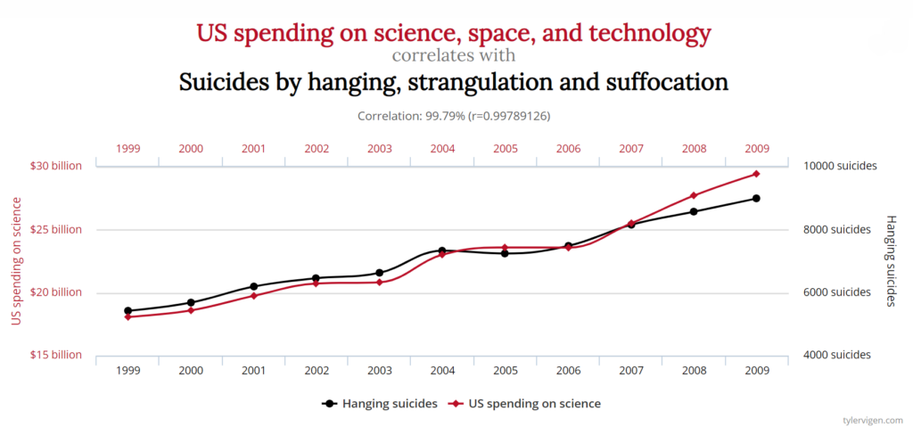
Correlation vs Causation
Two variables may move together without one causing the other.
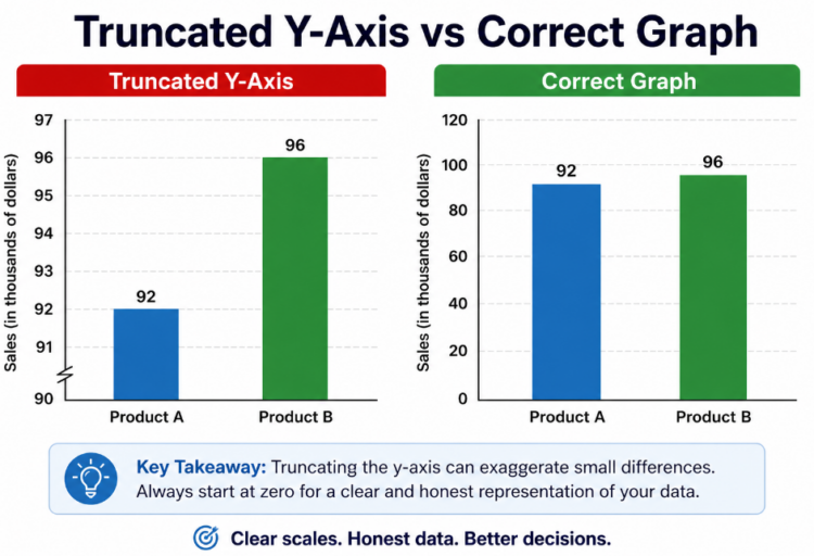
Misleading Percentages
Large percentages can hide very small changes.
Small Sample Sizes
Small samples often produce unreliable results.
Survivorship Bias
Ignoring failed cases and only studying successes.
How to Spot Misleading Statistics
To evaluate statistics critically, consider the following questions:
- What is the sample size?
- Who collected the data?
- Are the numbers shown as percentages or absolute values?
- Is important context missing?
- Does the claim confuse correlation with causation?
Understanding these factors can help you avoid being misled by persuasive numbers.
Why Media and Marketing Use Misleading Statistics
Statistics make headlines more compelling.
A dramatic percentage increase or surprising statistic can attract attention and generate clicks.
However, simplifying complex data often leads to oversimplified or misleading interpretations.
This is why critical thinking is essential when interpreting statistical claims.
For deeper research on data interpretation, you can explore resources such as:
Our World in Data
https://ourworldindata.org
Pew Research Center
https://pewresearch.org
Harvard Business Review
https://hbr.org
📘 Improve Your Data Literacy
Understanding misleading statistics is one of the most valuable skills today. These books will help you go beyond examples and build real critical thinking skills:
Conclusion
Statistics are powerful tools for understanding the world, but they can also create misleading impressions.
By learning to recognize common statistical manipulation techniques such as cherry picking, misleading percentages, and small samples, readers can better evaluate the claims they encounter in news, advertising, and research.
The next time you see a surprising statistic, it’s worth asking a simple question:
What story is the data really telling?
FAQ
What are misleading statistics?
Misleading statistics are numbers presented in a way that creates a false impression, often through selective data, biased samples, or misleading percentages.
Why are misleading statistics common in media?
Statistics make stories more persuasive and memorable, which encourages their use in headlines and reports.
How can you detect misleading statistics?
Check the source of the data, examine the sample size, and look for missing context or exaggerated percentages.
What is the most common way statistics are manipulated?
Cherry picking data and confusing correlation with causation are among the most common techniques.
🔗 Internal links
If you found these examples interesting, explore related analyses:
👉 Misleading Graphs Examples in 2025
👉 Misleading Data: Real-Life Examples
👉 Shrinkflation Examples – The Invisible Price Hike
These articles explore how statistics, data visualization, and economic signals can distort perception and influence decisions.