Introduction
Misleading data examples are everywhere, yet most people trust data without questioning it.
But in reality, many statistics and numbers can be presented in ways that distort the truth.
These examples show how easily data can be manipulated in everyday life. From marketing to news and social media, misleading data is everywhere.
Understanding these examples will help you think more critically and avoid being misled.
Research from Harvard Business Review explains how misleading data examples can influence decision-making and perception.
What Is Misleading Data?
Misleading data refers to information that is technically correct but presented in a way that creates a false impression.
This can happen through:
- selective data
- missing context
- misleading comparisons
- biased samples
Many of these cases rely on subtle tricks rather than obvious errors.
15 Misleading Data Examples in Real Life
1. “50% Increase” Without Context
A product claims a “50% improvement,” but the actual change is from 2% to 3%.
👉 This is one of the most common cases.
2. Averages Instead of Medians
Average income can be misleading if a few high earners skew the data.
👉 Median values often give a more accurate picture.
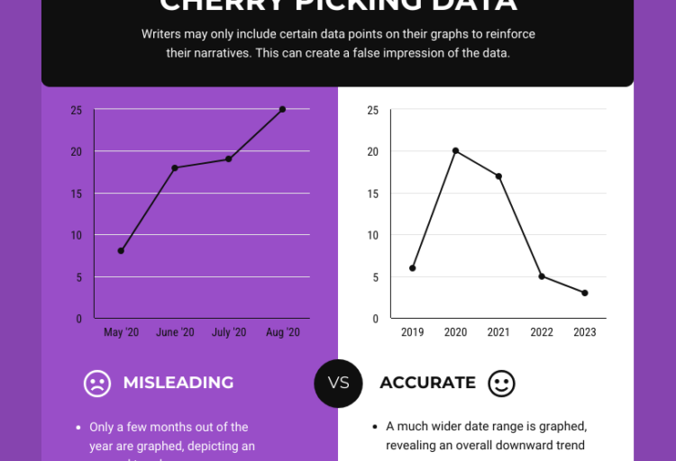
3. Cherry-Picked Data
Only showing data that supports a specific argument.
👉 Frequently used in marketing and media.
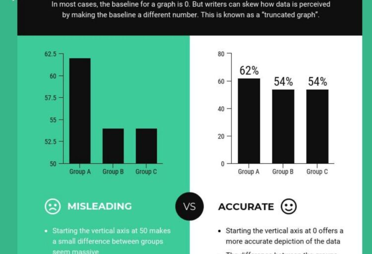
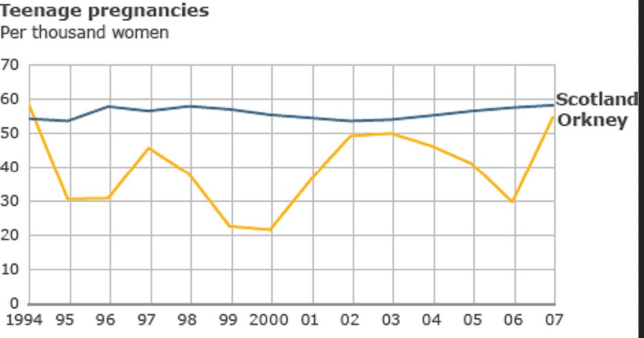
4. Misleading Graph Scales
Graphs that exaggerate differences using distorted scales.
👉 Learn more here:
https://empirestats.net/2026/03/26/misleading-graphs-examples
5. Small Sample Sizes
Drawing conclusions from a very small group of people.
👉 One of the most overlooked issues.
6. Correlation vs Causation
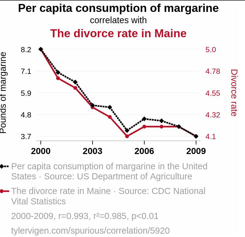
Just because two things happen together doesn’t mean one causes the other.
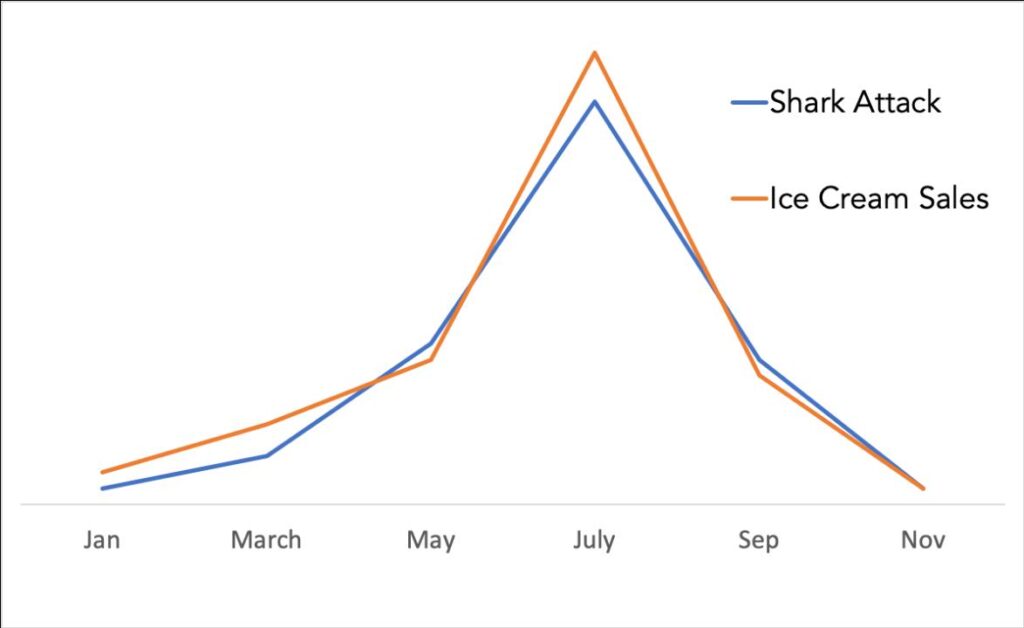
Another two interesting examples:
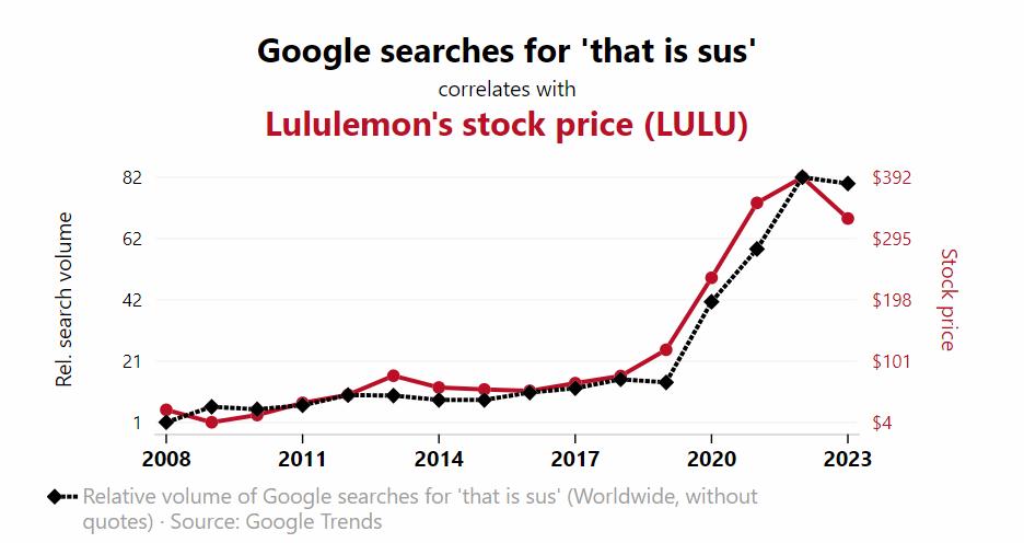
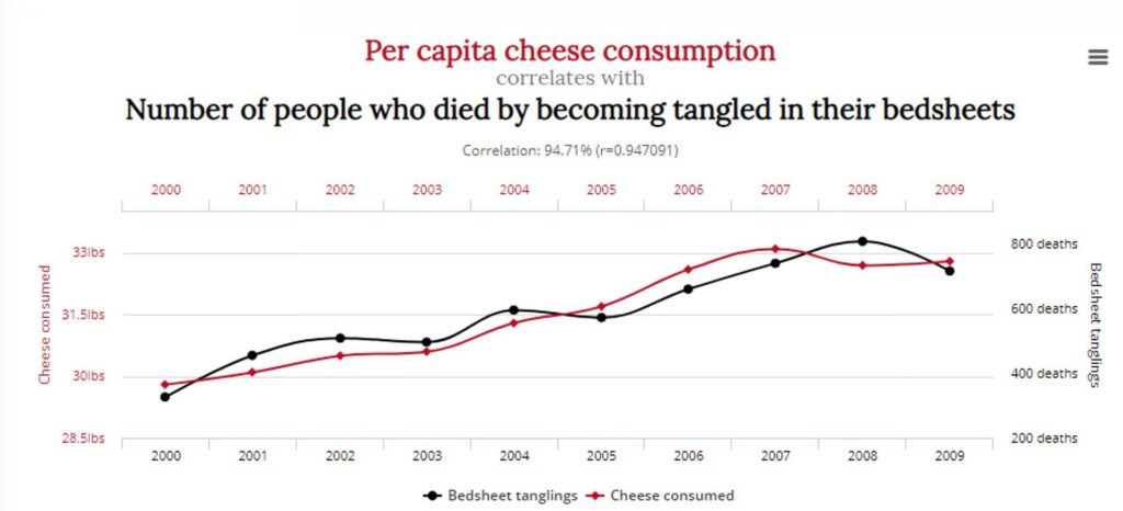
Tyler Vigen’s famous collection highlights how unrelated variables can appear strongly correlated.
7. Percentages Without Base Numbers
Saying “200% increase” without showing the original value.
According to the UK Statistics Authority, misleading data often come from poorly presented percentages and missing context.
8. Selective Timeframes
Showing only specific time periods to support a narrative.
9. Misleading Surveys
Survey questions can be biased or poorly designed.
10. Data Without Context
Numbers without explanation can easily be misinterpreted.
11. Comparing Incompatible Data
Comparing data that isn’t directly comparable.
12. Inflation Ignored
Using nominal values instead of inflation-adjusted data.
13. Survivorship Bias
Focusing only on successful cases and ignoring failures.
14. Visual Distortion in Charts
Charts designed to exaggerate differences.
👉 See real examples:
https://empirestats.net/2026/03/16/misleading-statistics-examples
15. Misleading Headlines
Headlines that exaggerate or simplify complex data.
👉 Often seen in news articles:
https://empirestats.net/examples-of-misleading-news
Why Misleading Data Is So Common
Misleading data is common because:
- people trust numbers
- data is rarely questioned
- presentation influences perception
- context is often missing
These factors make this type of data very effective.
How to Spot Misleading Data
To identify misleading data:
- check the source
- look for missing context
- question percentages
- compare multiple sources
- analyze how data is presented
Being aware of these patterns helps you avoid falling for misleading data.
FAQ
What are misleading data examples?
These examples are cases where data is presented in a way that creates a false or distorted impression.
Why is data misleading?
Data can be misleading due to poor presentation, missing context, or intentional manipulation.
How can you identify misleading data?
You can identify misleading data by checking sources, analyzing context, and questioning how information is presented.
Is misleading data always intentional?
No. Some of those examples are accidental, while others are intentionally designed to influence perception.
🔗 Explore more misleading data insights
If you found these examples useful, explore related topics:
👉 https://empirestats.net/2026/03/26/misleading-graphs-examples
👉 https://empirestats.net/2026/03/16/misleading-statistics-examples
👉 https://empirestats.net/examples-of-misleading-news
These articles show how misleading graphs, misleading statistics, and misleading news influence how we interpret information.