Introduction
Bar graphs are one of the most common ways to present data. They look simple, clear, and objective. But that is exactly why they can be so misleading.
A misleading bar graph can exaggerate small differences, hide important context, or make one result look much more dramatic than it really is. This happens in news articles, political polls, marketing reports, business presentations, and even school materials.
In this article, you will see 15 misleading bar graph examples, why each one is deceptive, and how to spot the problem before the graph tricks your brain.
These misleading bar graph examples show how easily data can be manipulated.
For a broader overview of visual data manipulation, see our full guide to misleading graphs examples.
What Is a Misleading Bar Graph?
A misleading bar graph is a bar chart that presents data in a way that creates a false or exaggerated impression.
The numbers shown in the graph may be technically correct, but the visual design can still mislead the reader. This often happens when the Y-axis does not start at zero, when the scale is uneven, when important categories are missing, or when the graph uses visual effects that distort the size of the bars.
For example, a company might show two bars representing $980,000 and $1,000,000 in revenue. If the Y-axis starts at $950,000 instead of zero, the difference may look huge, even though it is only about 2%.
That is why bar graphs are powerful but risky. They are easy to understand at a glance, but they can also make small differences look much bigger than they really are.
Why Bar Graphs Can Be Misleading
Bar graphs are especially easy to manipulate because readers usually compare the height or length of the bars visually. Most people do not stop to inspect the exact numbers, the axis, or the data source.
The most common problem is a truncated Y-axis. In a normal bar graph, the Y-axis should usually start at zero. When it starts at a higher number, the bars no longer show the full size of the values. Instead, they only show the difference between values, which can make small changes look dramatic.
Another problem is missing context. A bar graph may show only selected years, selected groups, or selected categories. This can make a trend look stronger, weaker, or more surprising than it really is.
This is one of the most common ways graphs lie: the numbers may be real, but the design changes how the data feels.
Bar graphs can also be misleading when they use inconsistent intervals, confusing labels, 3D effects, or colors that push the reader toward a specific interpretation.
Storytelling with Data also treats the zero-baseline rule as one of the few strong rules that most data visualization practitioners follow for bar charts.
In short, a bar graph becomes misleading when its design changes how the data feels, even if the numbers themselves are accurate.
Datawrapper also explains that truncated axes in column and bar charts can create major misinterpretations because the bar lengths no longer represent the true proportions of the values.
15 Misleading Bar Graph Examples
1. A Bar Graph With a Truncated Y-Axis
A truncated Y-axis is one of the most common misleading bar graph examples.
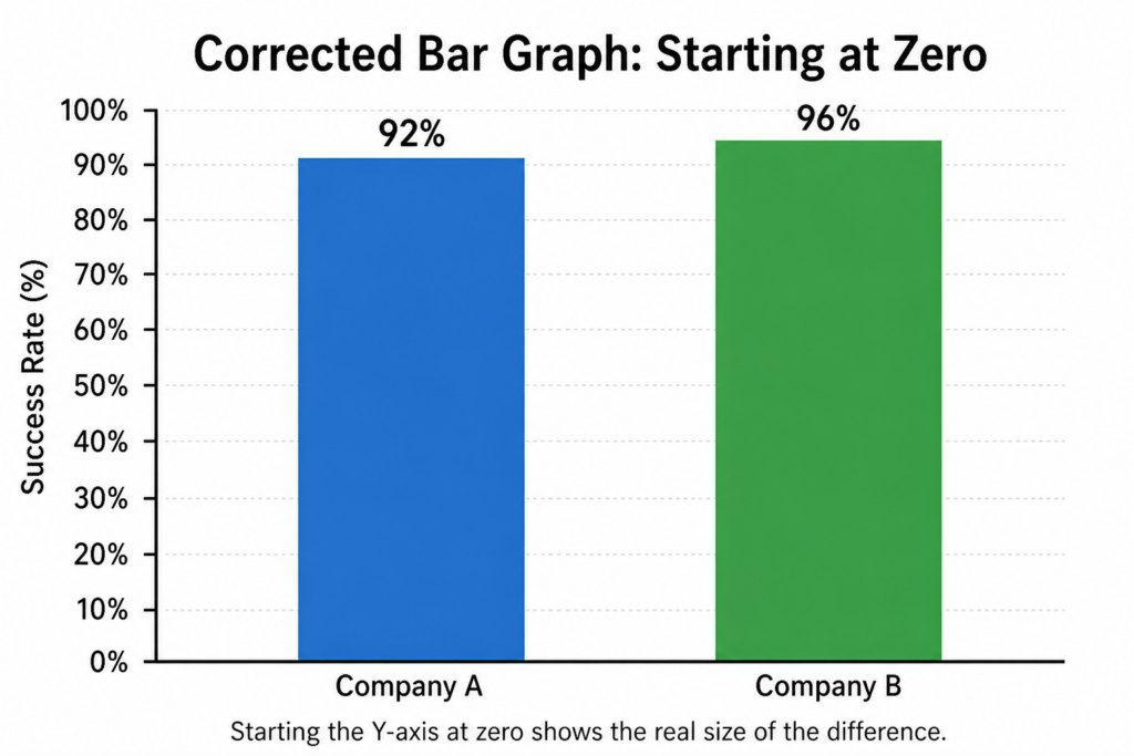
Imagine a bar graph comparing two companies. Company A has a customer satisfaction score of 92%, while Company B has a score of 96%. The difference is only four percentage points. But if the Y-axis starts at 90% instead of 0%, Company B’s bar may look several times taller than Company A’s.
This makes a small difference look much larger than it really is.
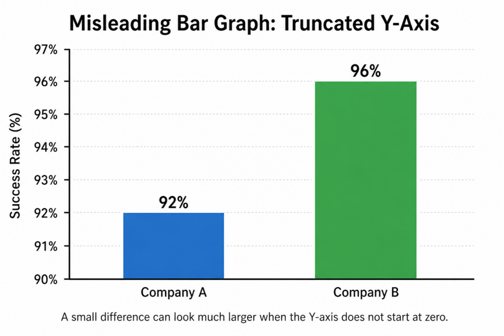
Here is one of the most common misleading bar graph examples used in reports.
The problem is not necessarily that the numbers are false. The issue is that the visual scale exaggerates the difference. Readers may walk away thinking one company is dramatically better, when the real gap is fairly small.
A better version would start the Y-axis at zero or clearly show that the axis has been shortened. For bar charts, starting at zero is usually the safest option because the length of each bar is supposed to represent the size of the value.
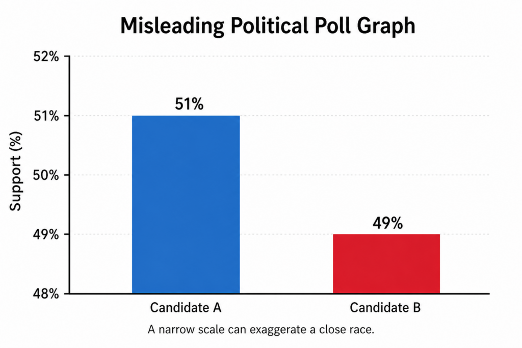
2. A Political Poll With Exaggerated Differences
Political polls are often shown as bar graphs because they make comparisons easy. But they can also be designed to make one candidate look much stronger than another.
For example, a poll might show Candidate A at 51% and Candidate B at 49%. That is a very close race. But if the Y-axis starts at 48%, Candidate A’s bar may look twice as tall as Candidate B’s.
This can give viewers the impression that Candidate A has a large lead, even though the difference may be within the margin of error.
The misleading part is the visual drama. A two-point difference should look small, not massive. Political graphics can also become misleading when they leave out undecided voters, margin of error, sample size, or the date of the poll.
A better graph would show the full scale, include the margin of error, and clearly label the sample size.
Small samples and exaggerated survey results are also common in misleading statistics examples.
3. A Sales Chart That Hides Decline
A company may use a bar graph to make its sales performance look stronger than it really is.
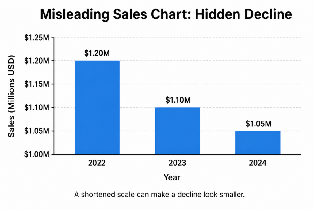
For example, imagine a business had sales of $1.2 million, $1.1 million, and $1.05 million over three years. Sales are clearly declining. But the company could choose a scale that starts at $1 million, making the decline look small and harmless.
The opposite can also happen. A tiny sales increase can be made to look dramatic by starting the axis just below the lowest value.
This type of graph is misleading because it changes the emotional meaning of the data. A decline can look stable, or a small increase can look like explosive growth.
A better graph should show enough context for readers to understand the real trend. That may mean including more years, showing percentage change, or adding a clear note explaining the scale.
4. A School Performance Chart With Missing Context
Schools, districts, and education reports often use bar graphs to compare test scores. These graphs can be useful, but they can also become misleading when they ignore context.
For example, a chart may show that School A has higher test scores than School B. At first glance, School A may look much better. But the graph may not show differences in funding, class size, student demographics, language support, or special education needs.
The bar graph is not necessarily false, but it is incomplete. It presents a simple comparison that may hide important factors behind the numbers.
This can mislead parents, policymakers, or readers into thinking that one school is simply “better” without understanding why the difference exists.
A better graph would include more context, such as student population, funding per student, year-over-year improvement, or confidence intervals.
5. A Social Media Growth Graph With Uneven Time Periods
Social media reports often use bar graphs to show follower growth, engagement, or traffic. One misleading trick is to compare uneven time periods.
For example, a chart may compare “January,” “February,” and “March to June” as if they are equal categories. The March-to-June bar will naturally be larger because it covers four months instead of one.
This can make growth look more impressive than it really is.
The same problem happens when a graph compares one week to one month, or one quarter to one year. If the time periods are not equal, the bars should not be compared directly.
A better graph would use equal time periods, such as monthly growth for each month. Another option is to show averages, such as average followers gained per day.
6. A Company Revenue Chart Starting Above Zero
A company revenue chart can be misleading when the Y-axis starts above zero.
Imagine a business comparing revenue from two products. Product A generated $500,000, while Product B generated $550,000. The difference is 10%. But if the chart starts at $490,000, Product B may look many times larger than Product A.
This can make a modest advantage look like a massive success.
This type of graph is common in marketing reports, investor presentations, and internal business dashboards. It is tempting because it makes progress look more exciting.
But for readers, it creates a distorted impression. The size of the bars no longer represents the true size of the values.
A better version would start at zero or use another chart type, such as a line chart, if the goal is to highlight small changes over time.
7. A News Chart Comparing Percentages Incorrectly
News graphics often simplify complex data. Sometimes, that simplification leads to misleading bar graphs.
For example, a news chart might compare a 20% increase in one category with a 20 percentage point increase in another category. These sound similar, but they are not the same.
A rise from 10% to 20% is a 10 percentage point increase, but it is also a 100% relative increase. If a graph mixes these ideas without explaining them, readers may misunderstand the size of the change.
Bar graphs can also be misleading when they compare percentages from different base groups. For example, 40% of a small group may represent fewer people than 10% of a much larger group.
A better graph should clearly explain whether it is showing percentages, percentage points, raw numbers, or rates.
8. A Healthcare Chart Using Different Baselines
Healthcare data is often complicated, and bar graphs can make it look simpler than it really is.
Imagine a graph comparing disease rates in two countries. Country A has 500 cases, and Country B has 1,000 cases. The graph may make Country B look much worse. But if Country B has a much larger population, the rate per person may actually be lower.
This is misleading because the graph compares raw totals instead of comparable rates.
Healthcare charts can also mislead when they compare different age groups, different testing levels, or different reporting methods. A country that tests more people may appear to have more cases simply because it detects more cases.
A better graph would use rates per 100,000 people, adjust for age when needed, and explain the data source clearly.
9. A Climate Chart With Selective Years
Climate data can be misleading when a bar graph shows only selected years.
For example, a chart might compare one unusually hot year with one unusually cool year to suggest a dramatic trend. Or it might choose a short time period that hides a longer-term pattern.
This is called cherry-picking. The data points may be real, but the selection creates a misleading story.
A bar graph showing only two or three years may not be enough to understand a climate trend. Weather varies naturally from year to year, so short-term comparisons can be deceptive.
A better graph would show a longer time period, use consistent intervals, and explain whether the chart is showing local, regional, or global data.
10. A Marketing Chart With Missing Competitors
Marketing charts are designed to persuade. That makes them especially vulnerable to misleading design.
For example, a company may show a bar graph comparing its product to two weaker competitors, while leaving out the strongest competitor in the market. The graph may be technically accurate, but it gives an incomplete picture.
Another version is showing only categories where the company performs well. For example, a software company might compare speed and price but leave out reliability, customer support, or security.
This is misleading because the graph controls what the reader sees and what the reader does not see.
A better graph would include a fair selection of competitors, explain the criteria, and show both strengths and weaknesses.
11. A Survey Result With Tiny Sample Size
Survey results often appear in bar graphs, but they can be misleading when the sample size is too small.
For example, a graph might say that 80% of users prefer a new product design. That sounds impressive. But if only 10 people answered the survey, that means only 8 people preferred it.
The bar graph makes the result look official and statistically meaningful, even when the sample is too small to support a strong conclusion.
This is especially misleading when the graph does not show how many people were surveyed, who they were, or how the survey was conducted.
A better graph would include the sample size, explain the survey method, and avoid making broad claims from a small group.
12. A Bar Chart With Misleading Colors
Colors can strongly influence how readers interpret a bar graph.
For example, a chart might use bright red for one category and neutral gray for another. Even if the numbers are similar, the red bar may feel more urgent, dangerous, or important.
Colors can also mislead when they imply a ranking that does not exist. A dark color may make one bar look more significant, while a lighter color makes another seem less important.
This type of manipulation is subtle. The data may be correct, but the design pushes the reader toward a specific conclusion.
A better graph should use colors consistently and avoid emotional color choices unless they have a clear purpose. If color represents a category or value, the meaning should be explained.
13. A 3D Bar Graph That Distorts Height
3D bar graphs often look more impressive, but they can make data harder to read.
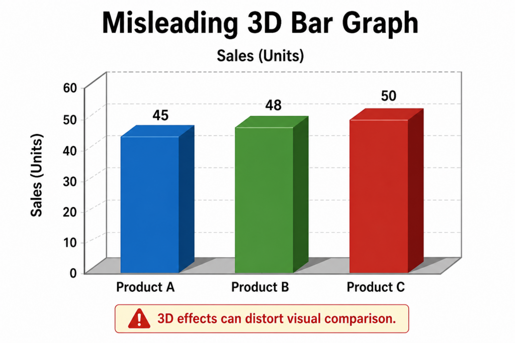
The problem is that 3D effects distort the height, depth, and position of the bars. A bar in the front may look larger than a bar in the back, even when the values are similar. Perspective can also make it difficult to see where the top of each bar meets the axis.
This makes the graph visually interesting but less accurate.
3D bar graphs are especially misleading when they are used for precise comparisons. Readers may focus on the visual shape instead of the actual numbers.
A better graph would use a simple 2D bar chart with clear labels. In data visualization, clarity is usually more important than decoration.
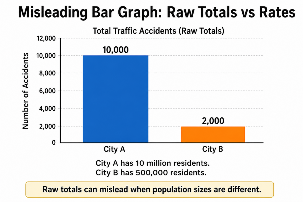
14. A Graph Comparing Absolute Numbers Instead of Rates
A bar graph can mislead when it compares absolute numbers instead of rates.
For example, imagine a graph comparing the number of traffic accidents in two cities. City A has 10,000 accidents per year, while City B has 2,000. At first glance, City A looks much more dangerous.
But if City A has 10 million residents and City B has 500,000 residents, the comparison changes. City B may actually have a higher accident rate per person.
This mistake is common in charts about crime, health, education, income, and population.
The problem is that raw totals do not always allow fair comparisons. Larger groups often have larger numbers simply because they are larger.
A better graph would show rates, such as accidents per 100,000 people, instead of only total accidents.
15. A Bar Graph With Hidden Labels
A bar graph can also be misleading when labels are missing, vague, or hard to read.
For example, a chart might show three bars labeled “Option A,” “Option B,” and “Option C” without explaining what those options mean. Or it might show percentages without saying what group the percentages refer to.
Another common issue is missing units. A graph may show values like 10, 20, and 30, but not explain whether those numbers represent dollars, people, millions, percentages, or index points.
This forces readers to guess. And when readers guess, they can easily misunderstand the data.
A better graph should clearly label the axes, categories, units, source, and time period. A good bar graph should be understandable without needing a long explanation.
How to Spot a Misleading Bar Graph
The easiest way to spot a misleading bar graph is to slow down and inspect the design before accepting the message.
Start with the Y-axis. Does it begin at zero? If not, the graph may be exaggerating the difference between bars. A truncated axis is not always wrong, but it should be clearly labeled and justified.
Next, look at the intervals. The numbers on the axis should increase by equal amounts. If the scale jumps from 0 to 10, then 10 to 50, then 50 to 100, the visual comparison may be distorted.
Then check the categories. Are any important groups missing? Are the categories comparable? Are time periods equal? A graph comparing one month to one year is not a fair comparison unless that difference is clearly explained.
You should also look for the source and sample size. A graph based on 20 survey responses should not be treated the same way as a graph based on thousands of responses.
Finally, pay attention to design choices. Bright colors, 3D effects, dramatic labels, or strange spacing can all influence how the data feels.
A good question to ask is: “Would I reach the same conclusion if I only looked at the numbers?“
Atlassian notes that bar charts should use a common zero-valued baseline so that the ratio in bar lengths matches the ratio in the actual values.
How to Avoid Creating Misleading Bar Graphs
To avoid creating a misleading bar graph, start with a simple rule: the design should make the data easier to understand, not more dramatic.
In most cases, bar graphs should start at zero. Because readers compare bar length visually, cutting off the axis can exaggerate differences. If you need to zoom in on a small difference, consider using a line chart or clearly mark the broken axis.
Use consistent intervals on your axis. Each step should represent the same amount. Uneven intervals can distort the visual relationship between values.
Choose categories fairly. Do not remove important groups just because they weaken your point. If you are comparing competitors, years, countries, or products, explain why those categories were selected.
Use clear labels. Every bar graph should make the units, time period, source, and categories easy to understand.
Avoid 3D effects. They rarely add useful information and often make the chart harder to read.
Finally, add context when needed. Sometimes the chart alone is not enough. A short note about sample size, margin of error, population size, or methodology can prevent readers from drawing the wrong conclusion.
Tableau recommends using a zero baseline for bar charts because it gives readers a clear and consistent foundation for comparing values.
FAQ About Misleading Bar Graphs
What makes a bar graph misleading?
A bar graph becomes misleading when its design creates a false impression of the data. This can happen because of a truncated Y-axis, missing labels, unequal intervals, cherry-picked categories, confusing colors, or missing context. The numbers may still be accurate, but the visual presentation can distort how readers understand them.
Should bar graphs always start at zero?
In most cases, yes. Bar graphs usually should start at zero because the length of each bar represents the size of the value. If the axis starts above zero, small differences can look much larger than they really are. There are exceptions, but they should be clearly explained.
Why are truncated bar graphs misleading?
Truncated bar graphs are misleading because they cut off part of the scale. This makes the remaining difference between bars look bigger than it actually is. For example, a change from 95 to 97 may look huge if the axis starts at 94, even though the real difference is small.
Are 3D bar graphs misleading?
3D bar graphs can be misleading because perspective, depth, and shadows make it harder to compare values accurately. A bar may look larger or smaller depending on where it appears in the chart. For clear communication, a simple 2D bar graph is usually better.
Where are misleading bar graphs commonly used?
Misleading bar graphs can appear in news articles, political campaigns, business reports, advertisements, social media posts, school materials, and research summaries. They are common anywhere data is used to persuade people quickly.
How can you tell if a bar graph is reliable?
A reliable bar graph has a clear scale, consistent intervals, visible labels, honest categories, and enough context to understand the data. It should also show the source, time period, and sample size when relevant. If a graph hides these details, be careful.
Conclusion
Bar graphs are useful because they make data easy to compare. But that simplicity can also make them dangerous.
Understanding misleading bar graph examples helps you avoid being fooled by bad data visualization.
A misleading bar graph does not always use fake numbers. Often, the deception comes from the design: a shortened axis, missing context, selective categories, confusing colors, or visual effects that exaggerate the difference between values.
The best way to protect yourself is to look beyond the height of the bars. Check the axis, the labels, the source, the sample size, and the context. A graph should help you understand the data, not trick your brain into seeing a story that is not really there.