Introduction
Digital products are designed to feel intuitive and helpful. But behind many “friendly” interfaces lies a different reality: subtle manipulation.
In this article, we explore 9 dark patterns examples that companies use to influence user behavior without users fully realizing it. These design tricks don’t rely on lies – they rely on psychology, attention, and habit.
Once you know how they work, you’ll start noticing them everywhere.
What Are Dark Patterns?
Dark patterns are user interface designs intentionally crafted to steer users toward decisions they might not otherwise make.
They often aim to:
- Increase subscriptions
- Reduce cancellations
- Collect more personal data
- Encourage impulsive purchases
Unlike outright scams, dark patterns stay just inside the boundaries of legality — which makes them widespread.
Dark patterns have been extensively documented by UX researchers and digital rights organizations such as the Nielsen Norman Group and the Electronic Frontier Foundation.
Why Dark Patterns Are So Effective
Dark patterns work because they exploit human behavior:
- Cognitive overload (too many choices at once)
- Loss aversion (fear of missing out)
- Default bias (people stick with pre-selected options)
- Time pressure (false urgency)
According to behavioral research, users rarely read interfaces carefully – they scan them.
Behavioral design research shows that users are highly susceptible to default bias and decision fatigue, especially in digital environments.
That’s where manipulation thrives.
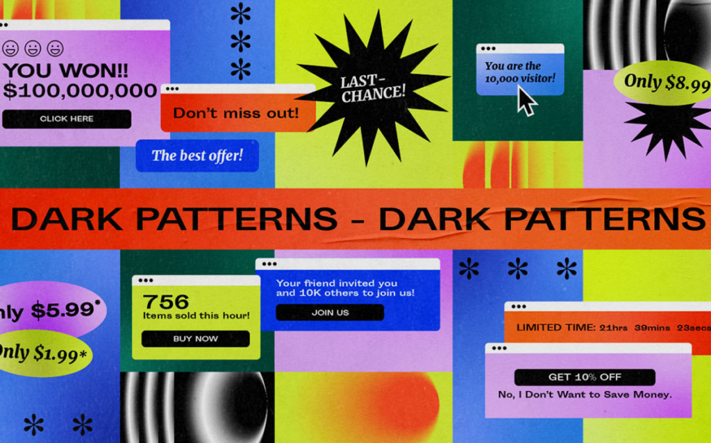
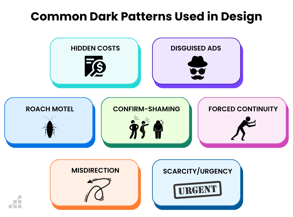
9 Dark Patterns Examples You See Every Day
1. Forced Opt-In Defaults
Newsletter boxes pre-checked by default during checkout.
→ Manipulation: Users forget to uncheck
→ Result: Consent without awareness
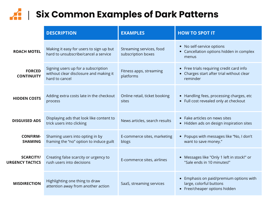
2. Hidden Cancellation Paths
Cancel buttons buried under multiple menus.
→ Manipulation: Friction discourages action
→ Result: Users keep paying longer
3. Confirmshaming Language
This dark pattern example relies on emotional pressure rather than rational choice.
Messages like:
“I don’t want to save money” when opting out.
→ Manipulation: Emotional guilt
→ Result: Higher conversion
4. Fake Urgency Timers
Countdowns that reset every visit.
→ Manipulation: False scarcity
→ Result: Impulsive purchases
5. Disguised Ads as Content
This dark pattern example is especially common on news and recommendation platforms.
Ads styled as articles or recommendations.
→ Manipulation: Visual camouflage
→ Result: Misleading clicks
6. Subscription Traps
Easy sign-up, difficult exit.
→ Manipulation: Asymmetrical effort
→ Result: Retention through friction
7. Price Obfuscation
Monthly prices shown instead of annual totals.
→ Manipulation: Scale distortion
→ Result: Underestimated cost
8. Roach Motel Design
The roach motel is a classic dark pattern example used in subscription services.
Entering a service is easy; leaving is complex.
→ Manipulation: One-way UX
→ Result: User fatigue
9. Data Sharing Fatigue
Repeated consent popups until users accept.
→ Manipulation: Exhaustion compliance
→ Result: Data over-collection
Why Dark Patterns Are Hard to Regulate
Most dark patterns:
- Do not involve false information
- Operate through implication
- Exploit legal gray areas
Regulation struggles because intent is difficult to prove – even when outcomes are clear.
Regulators have acknowledged the difficulty of proving intent, as highlighted in reports from the UK Competition & Markets Authority.
How to Protect Yourself
To avoid falling victim:
- Slow down on important screens
- Look for hidden toggles
- Question urgency cues
- Actively search for opt-out paths
- Use browser tools that expose UI manipulation
Awareness remains the most powerful defense.
The Mozilla foundation does an amazing job addressing this topic.
Conclusion
Dark patterns thrive in silence. They don’t shout – they nudge.
By learning to recognize dark patterns examples, you regain agency over your digital decisions. The interface hasn’t changed – you have.
And that alone makes manipulation far less effective.
FAQ
Q1. Are dark patterns illegal?
Not always. Many exist in legal gray zones.
Q2. Do all companies use dark patterns?
No, but they are widespread in subscription-based and ad-driven models.
Q3. Are dark patterns increasing?
Yes – especially as competition for attention intensifies.
Q4. Can design be ethical?
Absolutely. Transparent UX improves trust and long-term retention.
🔗 Internal links
If you found this analysis useful, explore related articles:
👉 Misleading Data: Real-Life Examples
👉 Misleading Graphs Examples in 2025
👉 Shrinkflation Examples – The Invisible Price Hike
These articles examine how perception, numbers, and design shape behavior.