Introduction
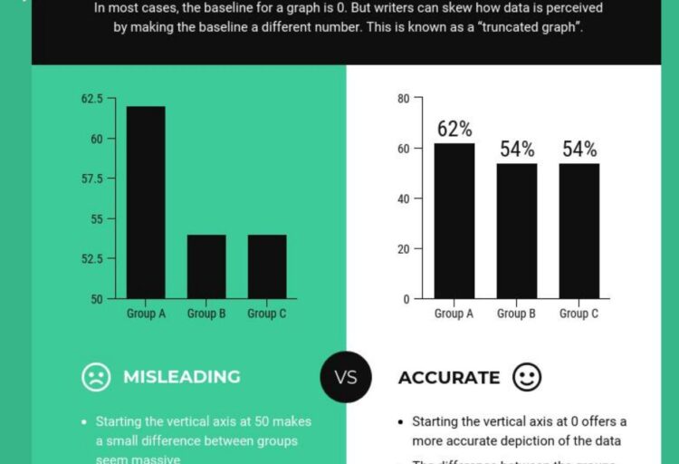
A truncated y-axis can make a small difference look much larger than it really is.Truncated y-axis graph examples show how a simple chart can make small differences look much bigger than they really are.
A truncated y-axis happens when the vertical axis of a graph does not start at zero. This can be especially misleading in bar charts, where the height of each bar visually represents the size of the value.
These truncated y-axis graph examples are useful because they show how accurate numbers can still create a misleading visual impression.
In this article, you’ll see 10 truncated y-axis graph examples, why they can be misleading, and how to spot them quickly.
What Is a Truncated Y-Axis Graph?

The same sales data can tell a very different story when the y-axis is truncated.A truncated y-axis graph is a chart where the vertical axis starts above zero instead of beginning at zero.
The truncated y-axis graph examples below show how this can happen in bar charts, line charts, polls, news graphics, and business reports.
Throughout these truncated y-axis graph examples, the main problem is not the data itself, but the way the scale changes the visual story.
For example, instead of showing values from 0 to 100, a chart might only show values from 80 to 100. This makes the visual differences between bars or lines look much larger.
The numbers may still be technically correct, but the visual message can be misleading.
This is also called:
- a truncated axis
- a cut-off y-axis
- a missing zero baseline
- y-axis manipulation
- a misleading graph scale
Truncated y-axes are not always wrong, but they become a problem when they make small differences look dramatic.
Why Truncated Y-Axis Graphs Can Be Misleading
Truncated y-axis graphs can mislead readers because they change how the data looks visually.
A small change in numbers can appear huge when the graph removes the full scale.
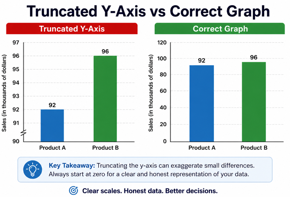
For example, imagine two products with customer satisfaction scores:
| Product | Satisfaction Score |
|---|---|
| Product A | 92% |
| Product B | 96% |
The real difference is only 4 percentage points.
But if the y-axis starts at 90 instead of 0, Product B may look several times better than Product A. That visual exaggeration is what makes truncated graphs risky.
This is one of the common ways how graphs lie.
Datawrapper explains that column and bar charts should start at zero because truncating the y-axis can significantly distort how readers perceive the data.
10 Truncated Y-Axis Graph Examples That Distort Data
1. Bar Chart With a Missing Zero Baseline
A bar chart is one of the worst places to use a truncated y-axis.
It is also one of the clearest truncated y-axis graph examples because the missing zero baseline changes the visual comparison immediately.
In a bar chart, the height of each bar is supposed to represent the size of the value. If the y-axis does not start at zero, the bars no longer show the true proportion between values.
Example:
| Product | Sales |
|---|---|
| Product A | 950 |
| Product B | 1,000 |
The difference is only 50 sales, or about 5.3%.
But if the y-axis starts at 900, Product B may look twice as high as Product A. That makes a small difference look like a major gap.
This is a classic misleading bar chart with a truncated axis.
2. Political Poll Graph That Exaggerates a Small Lead
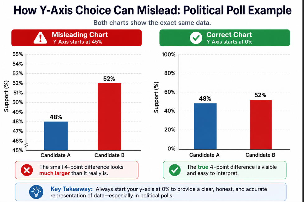
A 4-point poll difference can look much larger when the y-axis starts at 45%.Political poll charts often use percentages that are close together.
Example:
| Candidate | Poll Result |
|---|---|
| Candidate A | 48% |
| Candidate B | 52% |
A 4-point difference may be meaningful, but it is not visually huge.
If the y-axis starts at 45 instead of 0, Candidate B can look far ahead. The chart may make a close race look like a landslide.
This is misleading because the visual impression is stronger than the actual data.
Better version:
- start the y-axis at zero
- clearly label the margin of error
- show the actual percentage difference
- avoid making small poll differences look massive
3. Sales Growth Chart That Looks More Impressive Than It Is
Businesses may use truncated y-axis graphs to make growth look more dramatic.
Example:
| Month | Sales |
|---|---|
| January | $98,000 |
| February | $101,000 |
| March | $104,000 |
Sales are increasing, but slowly.
If the y-axis starts at $95,000, the line may look like explosive growth. If the y-axis starts at zero, the increase looks much more moderate.
The data is not fake, but the scale changes the story.
This type of graph can be used in reports, investor presentations, sales dashboards, and marketing materials.
4. Stock Market Graph That Makes a Small Drop Look Huge
Stock charts often use narrow y-axis ranges because investors care about small changes.
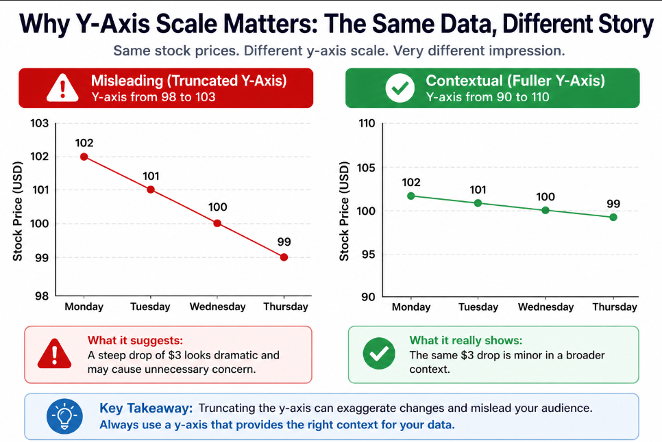
A narrow y-axis can make a small stock movement look like a dramatic drop.That can be useful, but it can also be misleading when the chart is shown without context.
Example:
| Day | Stock Price |
|---|---|
| Monday | $102 |
| Tuesday | $101 |
| Wednesday | $100 |
| Thursday | $99 |
The stock dropped from $102 to $99. That is a real decrease, but not a collapse.
If the chart only shows prices from $98 to $103, the line may look like a steep crash. Without the full context, readers may overreact.
A better chart should make the scale clear and include enough context to understand the real size of the change.
5. School Test Score Chart With a Narrow Scale
Schools may compare test scores across classes, years, or districts.
Example:
| Class | Average Score |
|---|---|
| Class A | 84 |
| Class B | 87 |
| Class C | 89 |
The differences are small.
But if the y-axis starts at 80, Class C may look much stronger than Class A. The chart may suggest a major performance gap when the actual difference is only 5 points.
This matters because education charts can influence decisions about teachers, students, funding, or school quality.
A clearer version should show the full scale or explain why the axis was shortened.
6. Healthcare Risk Chart That Exaggerates Differences
Healthcare statistics can be confusing, especially when graphs show risk percentages.
Example:
| Group | Risk |
|---|---|
| Group A | 2.1% |
| Group B | 2.6% |
The difference is 0.5 percentage points.
But if the y-axis starts at 2.0%, the second bar may look much taller than the first. This can make a small absolute risk difference look alarming.
That does not mean the difference is unimportant. It means the chart should clearly show both the relative and absolute difference.
This is why misleading graph examples often overlap with misleading statistics examples.
7. News Chart With a Cut-Off Y-Axis
News charts need to be simple and fast to understand. That also makes them easy to manipulate.
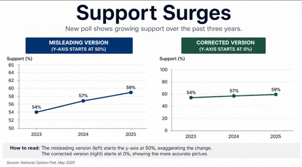
A cut-off y-axis can make a modest increase look like a major surge.A news outlet may show a chart where the y-axis starts close to the lowest value. This can make a small change appear dramatic in a headline or social media post.
Example:
| Year | Support |
|---|---|
| 2023 | 54% |
| 2024 | 57% |
| 2025 | 59% |
Support increased, but not massively.
If the y-axis starts at 50%, the increase may look like a sharp surge. If the y-axis starts at 0%, the increase looks more modest.
This is one reason readers should be careful with misleading news examples.
8. Website Traffic Chart That Makes Growth Look Bigger
Website traffic charts often use truncated axes in dashboards.
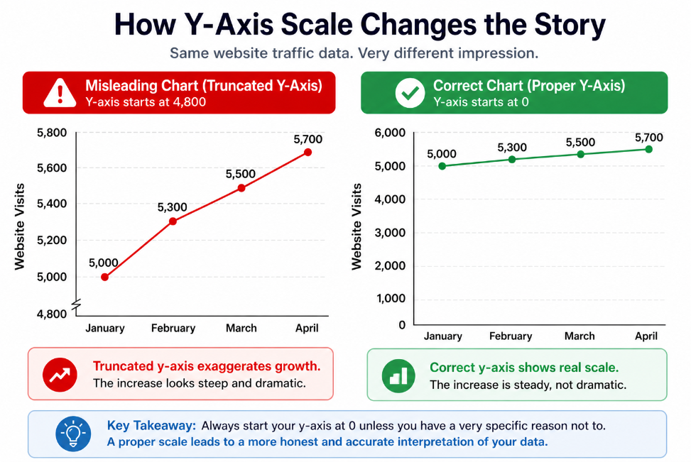
The same website traffic data looks more dramatic when the y-axis starts at 4,800 instead of 0.Example:
| Month | Visits |
|---|---|
| January | 5,000 |
| February | 5,300 |
| March | 5,500 |
| April | 5,700 |
The site is growing. That is real.
But if the chart starts at 4,800 visits, the increase may look huge. If the chart starts at zero, the growth still appears positive, but less extreme.
This matters because traffic charts can influence business decisions, content strategy, and marketing budgets.
A better version should show the full scale or include the percentage change clearly.
9. Climate Chart With a Manipulated Y-Axis
Climate data is often shown with small numerical changes over long periods of time.
A truncated y-axis can make a change look either more dramatic or less dramatic, depending on how the chart is designed.
Example:
| Year | Temperature Anomaly |
|---|---|
| 2020 | 1.01°C |
| 2021 | 1.08°C |
| 2022 | 1.13°C |
| 2023 | 1.20°C |
If the y-axis starts at 1.0°C, the increase may look visually extreme. If the y-axis uses a wider range, the trend may look less dramatic.
The key is context. Climate charts should clearly show the scale, the time period, and what the values represent.
The problem is not always the truncated axis itself. The problem is when the chart hides context or makes the reader draw the wrong conclusion.
10. Company Performance Chart With a Truncated Axis
Companies may use truncated axes in annual reports, pitch decks, or marketing materials.
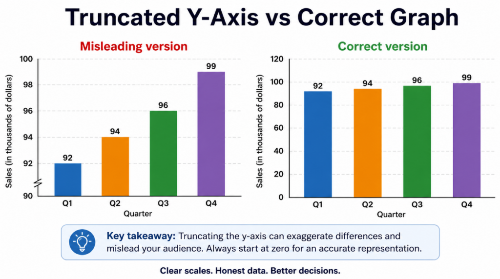
Company performance charts can exaggerate steady growth when the y-axis is truncated.Example:
| Quarter | Customer Satisfaction |
|---|---|
| Q1 | 91% |
| Q2 | 92% |
| Q3 | 93% |
| Q4 | 94% |
This is steady improvement.
But if the y-axis starts at 90%, the chart may look like the company made a huge leap in performance.
That can mislead investors, customers, or employees. The improvement is real, but the visual scale exaggerates it.
Truncated Y-Axis vs Correct Graph
A truncated y-axis graph can make a small difference look dramatic. A correct graph with a zero baseline shows the real size of the difference.
Before trusting a chart, check the baseline, scale, labels, and actual numbers.Example:
| Version | What It Does |
|---|---|
| Truncated y-axis graph | Zooms in on a small range and exaggerates differences |
| Correct graph | Starts at zero and shows the full proportion |
| Best use | Truncated axes may be acceptable for some line charts |
| Worst use | Truncated axes are usually misleading in bar charts |
For bar charts, starting at zero is usually the safest choice because the height of each bar represents the full value.
For line charts, a truncated y-axis can sometimes be acceptable if the goal is to show small changes over time. But the chart must clearly label the axis so readers understand the scale.
When Is a Truncated Y-Axis Acceptable?
A truncated y-axis is not always wrong.
It can be acceptable when:
- the chart is a line chart
- the axis labels are clear
- the goal is to show small changes over time
- the chart does not hide the true scale
- the reader can easily understand the baseline
However, truncated y-axes are much more dangerous in bar charts.
Bars are visual objects. Their height matters. If the baseline is missing, the bar heights no longer represent the true size of the values.
A truncated y-axis is most misleading when it is used to make a small difference look large.
For more context, you can check general chart design guidance from sources like university data visualization guides or statistical literacy resources.
Observable gives a more nuanced explanation: bar charts should generally start at zero, while line charts sometimes require more judgment depending on the context.
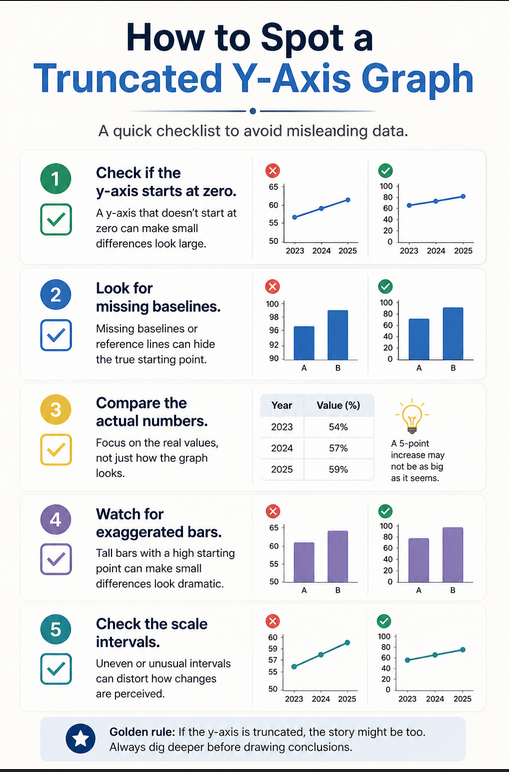
How to Spot a Truncated Y-Axis Graph
You can spot a truncated y-axis graph by checking the scale before trusting the visual message.
Ask these questions:
- Does the y-axis start at zero?
- Are the axis labels clearly visible?
- Are the intervals consistent?
- Is there a broken-axis symbol?
- Do the visuals match the actual numbers?
- Would the graph look different if it started at zero?
The fastest trick is simple: look at the actual numbers before reacting to the chart.
If the numbers are close together but the bars look very different, the graph may be using a truncated y-axis.
This is one of the most common data visualization mistakes.
How to Fix a Truncated Y-Axis Graph
To fix a misleading truncated y-axis graph, you can:
- start the y-axis at zero, especially for bar charts
- clearly label the y-axis
- avoid hiding the baseline
- use a line chart instead of a bar chart when showing small changes
- include the actual numbers near the chart
- explain why the axis is shortened if truncation is necessary
- avoid 3D effects or visual distortions
Here is a simple rule:
If the chart uses bars, start the y-axis at zero.
If the chart uses a line, a truncated y-axis may be acceptable, but only if the scale is obvious and the chart does not exaggerate the message.
These truncated y-axis graph examples show why readers should always check the baseline, scale, and actual numbers before trusting a chart.
Tableau also recommends starting bar chart axes at zero to avoid confusing readers and to provide a clear baseline for comparison.
Recommended Reading About Misleading Graphs
This article explains one specific graph trick: the truncated y-axis.
If you want to understand misleading graphs, statistics, and data visualization more deeply, these beginner-friendly books are useful:
- How to Lie with Statistics
- Storytelling with Data
- The Visual Display of Quantitative Information
- Naked Statistics
FAQ About Truncated Y-Axis Graphs
What is a truncated y-axis graph?
A truncated y-axis graph is a chart where the vertical axis does not start at zero. This can make small differences between values look much larger than they really are.
Why is a truncated y-axis misleading?
A truncated y-axis is misleading because it changes the visual scale of the graph. It can make a small difference look dramatic, especially in bar charts.
Is a truncated y-axis always wrong?
No, a truncated y-axis is not always wrong. It can be acceptable in some line charts when the axis is clearly labeled. However, it is usually misleading in bar charts because bar height represents the full value.
What is an example of a truncated y-axis?
An example of a truncated y-axis is a bar chart comparing 95% and 100%, but the y-axis starts at 90 instead of 0. This makes the difference look much larger than it really is.
Why are truncated y-axes especially misleading in bar charts?
Truncated y-axes are especially misleading in bar charts because people compare the height of the bars. If the chart removes the zero baseline, the bar heights no longer show the true proportion between values.
How do you fix a truncated y-axis graph?
You can fix a truncated y-axis graph by starting the y-axis at zero, clearly labeling the scale, showing the actual values, and avoiding visual exaggeration.
Final Thoughts – Conclusion
These truncated y-axis graph examples show how easy it is for a chart to distort perception without changing the actual numbers.
The data may be real, but the visual message can still be misleading.
Before trusting a graph, always check where the y-axis starts, whether the scale is consistent, and whether the visual difference matches the real numerical difference.
A good graph should make data easier to understand, not easier to misinterpret.
Explore More Misleading Data Examples
Add your usual internal recommendation block here.
Recommended internal links: