Introduction

Misleading graphs examples are everywhere. From news articles to social media and corporate reports, misleading graphs are often used to influence how people interpret data.
Every day, millions of people are misled by graphs that look perfectly legitimate. These misleading graphs examples show how simple visual tricks can completely distort reality.
According to Pew Research Center, data visualization strongly influences public perception.
Many readers assume graphs are objective, but in reality, graphs can be manipulated in subtle ways that completely change the message.
In this article, you’ll discover 25 misleading graphs examples that fooled millions, understand why graphs can be misleading, and learn how to identify misleading data visualization instantly.
Types of Misleading Graphs (With Examples)
Before diving into the misleading graphs examples, it’s important to understand the most common techniques used to distort data.
1. Truncated Y-Axis
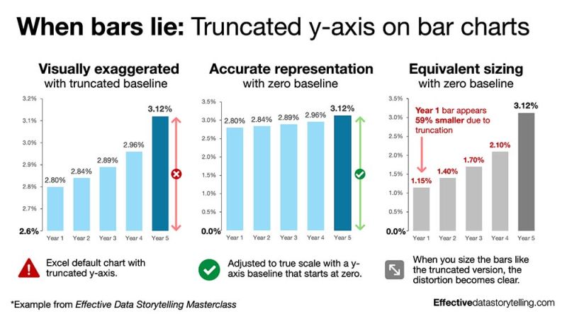
Graphs that don’t start at zero exaggerate differences.
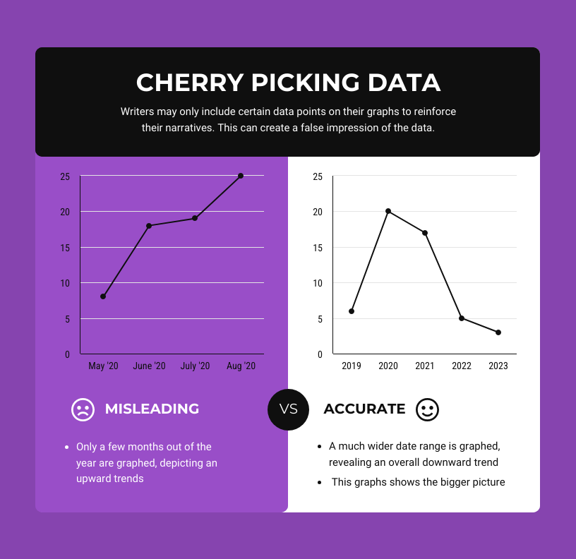
2. Cherry-Picked Data
Only showing selected data points to push a narrative.
3. Misleading Scales
Irregular intervals that distort trends.
4. 3D Graph Distortion
3D visuals that inflate perception.
5. Missing Context
Graphs without baseline or comparison.
These techniques appear repeatedly in misleading graphs examples across media and business.
A detailed breakdown of these misleading graphs techniques can be found on Data to Viz.
25 Misleading Graphs Examples That Fooled Millions
1. Truncated Growth Graph
A company shows “massive growth” by cutting the Y-axis.
2. Election Poll Distortion
Small differences appear huge due to scaling.
3. Revenue Spike Illusion
A minor increase looks dramatic.
4. Social Media Engagement Chart
Engagement looks explosive due to compressed timeline.
5. 3D Pie Chart Misrepresentation
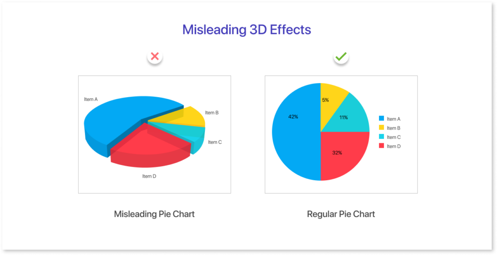
Segments appear larger than reality.
6. Misleading Graphs Example from Real News
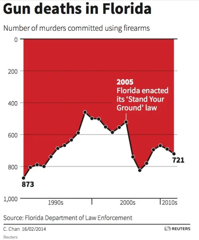
This is one of the most striking misleading graphs examples found in real news reporting. The graph uses an inverted y-axis and truncated scale, making it appear that gun deaths decreased significantly after a policy change.
In reality, the full dataset shows a different trend. This type of misleading graph relies on visual perception to create a false narrative, making it a powerful example of how data visualization can mislead millions.
7. COVID Case Graph Misuse
Data shown without population context.
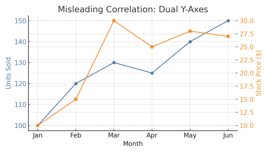
8. Salary Comparison Graph
Different scales used across bars.
9. Stock Market Chart Zoom Trick
Zooming creates fake volatility.
10. Marketing Conversion Graph
Only best-performing days shown.
11. Education Statistics Chart
Selective years highlight improvement.
Many misleading graphs examples are based on real-world datasets published by platforms like Statista.
12. Advertising ROI Graph
Outliers removed.
13. Crime Rate Visualization
Percentages used instead of absolute numbers.
14. Health Study Graph
Small sample size presented as general truth.
15. Product Comparison Chart
Competitors excluded.
16. Inflation Graph Distortion
Axes manipulated to reduce perceived inflation.
17. Survey Results Graph
Leading questions hidden.
18. Bar Width Manipulation
Wider bars exaggerate importance.
19. Misleading Line Breaks
Disconnected trends imply change.
20. Cumulative Data Trick
Makes growth look exponential.
21. App Growth Graph
Early users hidden to exaggerate growth.
22. Political Approval Ratings
Selective polling windows.
23. Energy Consumption Graph
Units changed mid-chart.
24. Population Growth Graph
Log scale not disclosed.
25. Misleading “Average” Graph
Median vs average confusion.
Why Misleading Graphs Examples Can Trick Your Brain
Misleading graphs examples work because most people:
- Trust visuals more than raw data
- Don’t check axes or scales
- Assume graphs are neutral
Graphs can mislead people by:
- Amplifying small differences
- Hiding important context
- Using visual bias
This is why misleading graphs are so effective in media and marketing.
Educational resources like Khan Academy explain how data interpretation errors happen.
How to Spot Misleading Graphs Easily
To identify misleading graphs examples instantly, check:
1. The Y-Axis
Does it start at zero?
2. The Scale
Are intervals consistent?
3. The Data Range
Is data cherry-picked?
4. The Labels
Are units clearly defined?
5. The Context
Is anything missing?
You can explore real datasets and verify trends using sources like Our World in Data.
FAQ
What are misleading graphs examples?
Misleading graphs examples are charts that distort data through scaling, selection, or design to influence interpretation.
Why are graphs misleading?
Graphs are misleading when they manipulate axes, omit data, or use visual tricks to exaggerate trends.
How can graphs mislead people?
Graphs can mislead people by altering perception through design choices like truncated axes or selective data.
Conclusion
Misleading graphs examples are powerful because they exploit how humans interpret visuals. By understanding how misleading graphs work and learning to spot them, you can avoid being misled and make better decisions based on real data.
If you regularly analyze data, recognizing misleading graphs is not optional, it’s essential.
🔗 Internal links
If you found these misleading graphs examples interesting, explore related analyses:
👉 Misleading Statistics Examples: 15 Real Cases That Prove How Data Can Lie
👉 Misleading Graphs Examples in 2025
👉 Shrinkflation Examples: The Hidden Price Increase Explained